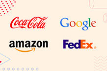
Calvin Klein, FedEx, Google, and Coca-Cola are some of the world’s most famous brands that use wordmark logos (logotypes). They skip images and symbols, focusing only on typography to represent their brands.
Designed with specific spacing, colors, and fonts, wordmark logos are a smart choice for businesses with distinctive and short names. They also work seamlessly across platforms, whether print or digital.
Today, let’s dive into the world of logotypes, discover when to use one for your brand, and get some tips on designing your own.
Different Types of Logos
If you’re at a point where you want to establish a brand identity and are ready to create a logo, you have a couple of options. Select the type that best represents your brand's personality and values.
- Logotype/Wordmark is designed with only the brand’s name and focused on typography.
- Lettermark/Monogram only displays the initials or letters of a company with a long name.
- Icon/Brandmark focuses only on graphics/symbols to represent a brand’s identity (no text)
- Combination Mark, as the name suggests, combines both graphics and text for versatility. Take Adidas, for example. This type of logo allows flexibility. You can either use the elements in your design together or separately.
- Emblem displays the text inside a badge/symbol.
- Abstract designs only use symbols, making them open to different interpretations.
- Mascot/character consists of an image (e.g., KFC) to represent a brand identity.
“Should I use a wordmark logo?” Yes - but only if…
- You’re new in your industry and you want to establish a name (brand recognition)
- You have a catchy business name! A wordmark logo can help you stand out from a sea of competitors.
- You have a short business name (one to two words), so avoid a wordmark if you have a longer business name. Otherwise, your logo will look bad on smaller screens.
What Is A Wordmark Logo?
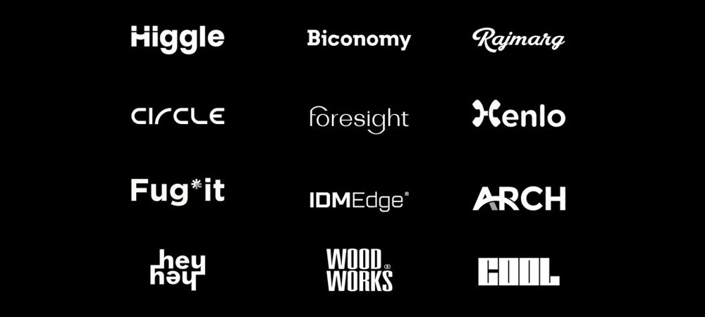
No badges, no symbols, no mascots, but only your company name in a stylized text- that’s a wordmark logo (logotype), putting the spotlight on your brand name. It is ideal for companies with catchy, easy-to-pronounce, and short names. Examples include Canon, Subway, and Vans.
Other famous examples:
New Balance first developed a strong brand recognition before transitioning into a wordmark in 2008. The company used a combination mark logo that had slanted initials above its full name in the 1970s. And as consumers might be unfamiliar with the initials NB, New Balance used colors and slanted styling to help them identify the logotype with the brand.
Then, there is FedEx. Its design is in the details. Take a look at the bold and clean typeface with a subtly added arrow between the letters “E” and “x”, conveying precision and speed, which are true to the company.
When designing a wordmark, focus on proper spacing between letters (kerning), weight, font, and (a bit of) letter shape adjustments. All these can affect your logo’s overall memorability and recognizability (more on this later). You can also consider a monogram version to fit smaller screens or spaces, like favicons.
When to Use a Wordmark Logo
A wordmark logo is independent of images, icons, symbols, or mascots because it focuses only on typography (font-based logo), nothing more.
The Google logo is an example. Its designers created “Product Sans,” a custom typeface (geometric sans-serif font) and used a slanted (and red) letter “E,” conveying nonconformity and playfulness.
The logo, as a whole, conveys innovation, accessibility, and simplicity.
Again, choose a logotype if you want to establish a name for your brand (new business). The right font choice is crucial in the design because it's the main feature of the logo (typography).
This type of logo also makes perfect sense when you have a distinctive and unique company name. (It can advertise your business immediately!)
On average, small businesses are spending between 7% to 10% of their gross revenue on marketing.
That’s about $70,000 to $100,000 for a business with $1 million in annual revenue on a wide range of marketing expenses, such as public relations, content marketing, advertising, trade shows, events, and search engine optimization.
As the logo spells your name, you can save some marketing money, especially valuable for startups and entrepreneurs with limited marketing budgets, and make your brand recognizable to consumers.
So, if your business is new and you have a limited budget initially, design a wordmark logo, which is easy to replicate across channels and marketing materials (print and digital).
This type of logo is also ideal for a versatile and timeless design, as mentioned earlier, adapting seamlessly across spaces, including physical branding, merchandise, and favicons.
And lastly, a logotype is perfect for a brand voice that portrays elegance, minimalism, and simplicity because it conveys focus and professionalism.
[Brand voice is your distinct personality - how you communicate with your target audience reflected in your approach to style, tone, and messaging, encompassing brand recognition. It must be applied to every touchpoint where consumers find and connect with you, including social media posts, newsletters, and advertising.]
Your Choice of Font Can Communicate Your Brand Personality
Ian Paget: “A great wordmark is the combination of a carefully selected font (or a designed set of letters) that leverages [cultural and visual associations], while also being carefully kerned.”
In short, legibility isn’t the only thing that matters when it comes to typography. Instead, it must be about letting your personality shine, as it should.
That is to say, your font choice can affect how people perceive your brand.
For example, a hand-drawn script conveys creativity, warmth, and a laid-back personality, while a sans-serif font signifies efficiency, precision, and modernity. Take the case of “Army” and “Etsy.”
The Army’s logo highlights structure, discipline, and authority with its blocky, bold, and all-caps lettering, while Etsy’s logo design conveys approachability and creativity (and evokes a handmade feel) for its serif font with warm curves.
Without even saying, the curves, styling, and weight of a logo font amplify brand qualities and carry a meaning.
Sharp edges and angles suggest strength and precision, while rounded letterforms exude approachability and friendliness. Nevertheless, an excellently-designed wordmark can tell your brand story - without you even saying a word.
Wordmark Logos: Practical Tips When Designing One for Your Company
Clarity and creativity: Balance these qualities when designing your wordmark, whose beauty is in the details, remember? Check out the primary elements to consider.
Typeface
Fonts are loaded with personality, helping with brand perception. They are keys to an effective logotype, portraying your brand voice and personality! It also prevents sending mixed signals to your audience.
- Font families (serifs, sans serifs, scripts, and slab serifs) are another important term to remember. Serifs feel prestigious and traditional, while sans serifs feel modern and innovative.
On the other hand, you have the slab-serif wordmarks (e.g., Volvo) that feel sturdy, confident, and bold. The last family, which is “script” fonts, adds a personal touch and seems playful and elegant, appearing more like a signature or a formal calligraphy.
- Weight refers to how thin or thick the characters are (e.g., light, italic, bold).
- Casing (lower, upper, or all-caps) also affects this logo’s appeal. For instance, your logo can convey a serious and professional personality with all-caps and a thick weight in the characters.
Shapes
Just as colors carry meanings, so do shapes. Consider the values you want your logo shape to represent. This should help you highlight your brand personality.
Set the tone with the right logo shape, which strengthens your message beyond only making a visually appealing icon.
Briefly, circles convey protection, unity, and security, while squares signal efficiency, strength, and professionalism. On the other hand, triangles express power and masculinity. Vertical lines signal progress and speed, while horizontal lines community and calmness.
Adding rectangles or circles can signify balance and boldness in your design, while ovals and circles can highlight unity and stability.
Nevertheless, you can experiment with shapes to see which reinforces your message, but avoid cluttering your design with too many elements.
Kerning/tracking
Either of these has to do with font spacing, but with slight differences.
Kerning is the “spacing” between characters or letters. With a higher kerning, it would mean designing your logo with letters farther apart from one another. You must check for proportions to avoid an “uncomfortable” design.
On the other hand, tracking is the overall spacing in your logo. Once you have designed one with proper kerning, you can always increase or decrease the tracking throughout it. Overall, ensure your logo’s kerning and tracking are proportional to make your logo visually appealing.
Size
Play around with the size of your font, which serves as the visual anchor in your design.
Experiment and explore whether a bigger or smaller font size will work for it. You can think about where you want to draw your audience’s attention or what you want to emphasize most about your brand.
Character
You can make your wordmark logo stand out with smart use of characters as well. Let’s take the HubSpot logo, for example.
If you notice, the designer (s) added a real image into the logo design, representing their services (a multi-tiered marketing platform and ways it can help with business growth).
Nevertheless, you can use a character in the logo font or simply add an extra image into one of the letters.
Colors
They affect our feelings, moods, and behaviors. That’s why, when designing your logo, whether with a graphic designer, DIY, or an AI logo maker, consider how you want your audience to feel looking at your logo.
It is because colors can give your brand logo a quality or a certain set of qualities (e.g., trustworthy, reliable, precise, professional, sporty). They can signal action because they influence or trigger psychological reactions.
- Red: love, passion, excitement
- Pink: earthy, reserved
- Yellow: cheerfulness, hope
- Black: professional, noble
- White: purity, truth
- Blue: hope, trust, wisdom, peace
- Orange: kindness, warmth
- Purple: glamorous, luxurious, mysterious
- Green: freshness, growth
Determine the message you want to convey to your audience when picking a color palette, because, again, colors have conscious and subconscious meanings.
However, stick with up to two color palettes only to avoid sending mixed messages and confusing your consumers. Also, consider what colors will complement your font choice. For instance, opt for muted colors with a playful wordmark typeface.
What to Avoid
Do not overcomplicate your logo design, although you want a unique look for it (or when you feel it is too simple). Here are things to remember.
- Don’t clutter the design with elaborate fonts. The power of wordmarks is in minimalism and simplicity. They still work best. Avoid hard-to-read, decorative typefaces, which can hurt legibility, especially when read on smaller screens or spaces, like business cards.
- Don't copy the style of another brand! While you might be feeling inspired by a particular design, remember that it’s your brand identity you’re trying to establish and not theirs.
- Don’t use too many colors, or your logo will have a chaotic appearance. It will also dilute your message in the design.
- Don’t skip scalability. Remember, your logo must look good everywhere (e.g., billboards and business cards).
- Don’t forget about spacing. Uneven spacing or poor kerning can give your logo an amateurish look. For instance, overadjusted spaces in a logo are uncomfortable to look at. Adjust spacing in small increments and test how your design looks.
- Don’t ignore legibility. Your company logo must be clear and readable, whether in print or digital platforms/channels.
Wordmark vs. Lettermark: What’s the Difference?
Wordmarks and lettermarks aren’t the same. Wordmark logos are a full display of a brand’s name, usually for companies with catchy and short names.
On the other hand, lettermark logos use only the brand name’s initials or abbreviations, working well for companies with hard-to-pronounce and long names (ESPN = Entertainment and Sports Programming Network).
But then, if you’re considering lettermarks, remember that they should have a previous exposure to a full company logo (strong brand recognition) because a lettermark logo is a very simplified version. Again, NB of New Balance was first exposed to the combination mark logo of the company before it was officially used in 2008.
Designing a Wordmark Logo with Logogenie’s AI Logo Maker
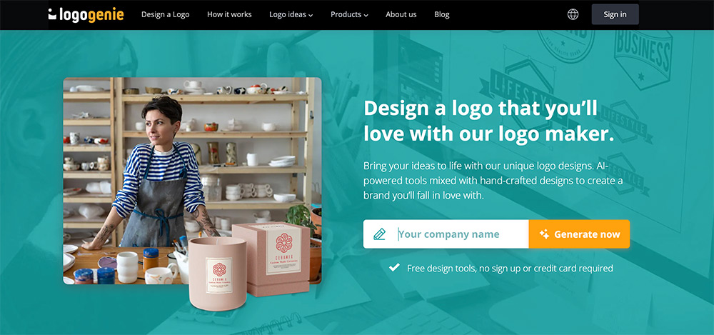
This AI logo generator offers anyone the freedom to design a powerful wordmark for their company in three simple steps.
- Enter your company name and details, and allow our logo maker to generate templates to choose from. Filter your design options with the search bar, and pick which one to customize.
- Personalize your design with colors, layout, and fonts.
- Download your logo in HD files!
Additional Tips
- Use the editor to adjust the spacing between letters and font weight.
- Feel free to experiment with the logo elements - typefaces, shapes, etc, and adjust them to improve style and ensure legibility.
- Preview your design on business cards, packaging, signage, social media, and more, ensuring it looks perfect in all places.
- Export in multiple formats, such as PDF, JPG, and SVG, ensuring you’ll have a version for web or print.
Final Thoughts
Wordmark logos are clean, uncomplicated, and minimalist logos, whose power lies in simplicity. They’re impactful, memorable, and timeless, effectively promoting brand recognition at a glance, and are easy to apply across platforms.
Wordmarks work perfectly for companies with shorter and unique names, so you might want a lettermark or monogram if you have a longer name. Lettermarks, in this case, will appear seamlessly on social media profiles, apps, and favicons.
Give your full attention to every single detail, including typeface, colors, kerning/spacing, and shapes, to create a versatile and sharp logo that showcases your brand personality. Ensure every element is spot-on (refer to our guide above for help).
Do not overcomplicate with the decorative elements, or your might harm your brand reputation (with your message getting diluted in the design).
Clueless on how to start? Start designing your logo with our intuitive, easy-to-use AI logo maker today and create a powerful wordmark for your company!
FAQ
Can I use shapes and icons in a logotype?
Certainly, but do not clutter your design with too many elements that stand out. Keep shapes/icons subtle so your brand name will have the spotlight.
What file formats should I print my logo with?
PNG is recommended for web and digital use, and PDF or SVG for print.
Can I copyright my wordmark?
Yes! Buy the exclusive rights option on the checkout page of Logogenie or via your user account. This will ensure you’re the only one with the unique logo design.
Are there disadvantages to a wordmark logo?
It may lack the visual impact you’ll get with a complex logo complete with illustrations or graphics because it focuses only on typography.
When should I use a wordmark logo?
You can use it if you have a unique business name, and you are a startup that wants to build name recognition.
What formats are available at logogenie.com?
Various formats (PNG black and white, JPG, PNG, and PDF)
Can I create different logo versions with Logogenie?
Yes - with different fonts, sizes, icons, and so on. Explore and feel free to use our innovative tool to design multiple logo versions.


