Logos are compelling branding tools. Think of the Amazon logo. They build awareness, showcase your company’s personality, and make your brand memorable. But today, we’ll focus on the timeless, clean, and concise lettermark logos and the world's top 10 most recognizable lettermark logos (Chanel, IBM, and NASA included). Let’s get started.
What Is a Lettermark Logo?
First, let’s talk about the basics. This logotype is composed of only a few letters. And typically your company’s initials. Many choose it for its neat and simple appearance, especially among brands with a long name.
Sometimes, it’s called a monogram, which is easily recognizable and memorable. It’s ideal for brands with complex names or those seeking a minimalist and modern brand identity.
Our AI logo maker can help you create a professional-looking and impactful lettermark logo. It’s simple! Enter your company’s initials, choose a font, and customize your design to align with your brand identity.
Top 10 Most Iconic Lettermark Logos in the World
Here, we present the best-designed monograms that are globally recognized. You can also use these as an idea when creating an app icon with your logo.
1. IBM
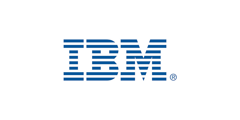
Thomas J. Watson Jr. took over IBM in 1956. He was known for the phrase “Good design is good business” and created the first design program for the company. Watson Jr. hired Paul Rand to design the IBM logo in the 1970s.
IBM’s minimalist logo is notable for its horizontal blue stripes, symbolizing dynamism and speed, two known company traits. Meanwhile, its geometric font conveys professionalism, strength, and reliability, fitting for a tech company.
Why We Think It’s Great?
The stripes create movement, evoking progress and innovation, while the three-letter mark conveys leadership, trust, and authority in the field. We also believe it’s visually balanced and readable regardless of size.
The Lesson
You can create a timeless brand with a logo that aligns with the values of your industry.
2. CNN
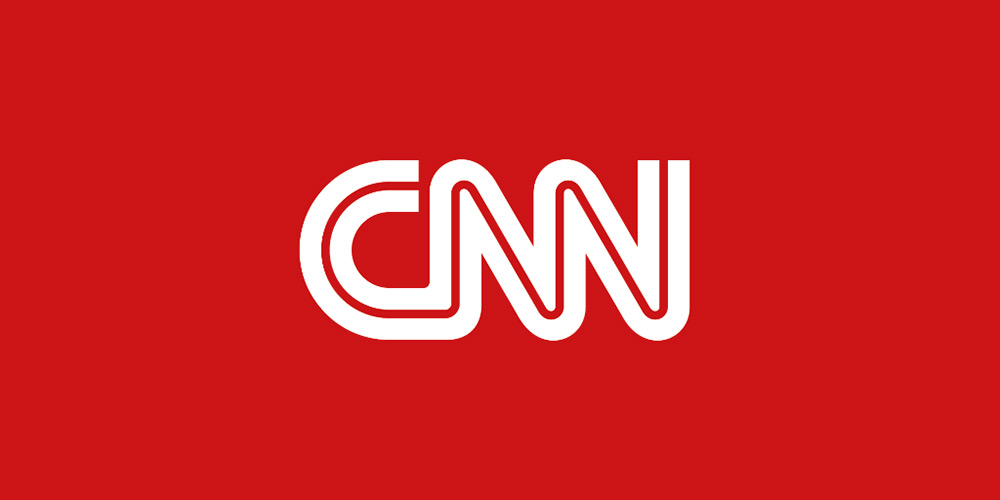
Anthony Guy Bost designed CNN’s first logo in 1980. It was designed to be easily recognizable, simple, and bold—qualities embodying a TV network. Like other known companies, CNN’s lettermark logo has changed, and from 2014 to today, the company has made enhancements to the original logo to keep it effective across platforms, including on mobile devices.
While they retained the previous logo, the refined logo needed some tweaking. They changed the logotype color to dark red, and the letter “C” was shortened slightly.
The logo is distinguishable because of the three letters connected with an unending red line. This represents CNN’s mission to give viewers real-time information and a smooth news flow. It also represents connectivity while remaining impactful and straightforward.
Why We Think It’s Great?
The “red” color captures attention, which is ideal for a news network, while the linked letters indicate unity and global outreach. The logo is readable and legible on TV and mobile devices.
The Lesson
Choose typography that will send your message and narrate your brand story effectively. Use your logo as your storyteller.
You can use the ideas for the best color combinations we presented in this guide when designing your lettermark logo.
3. NASA ("The Worm")
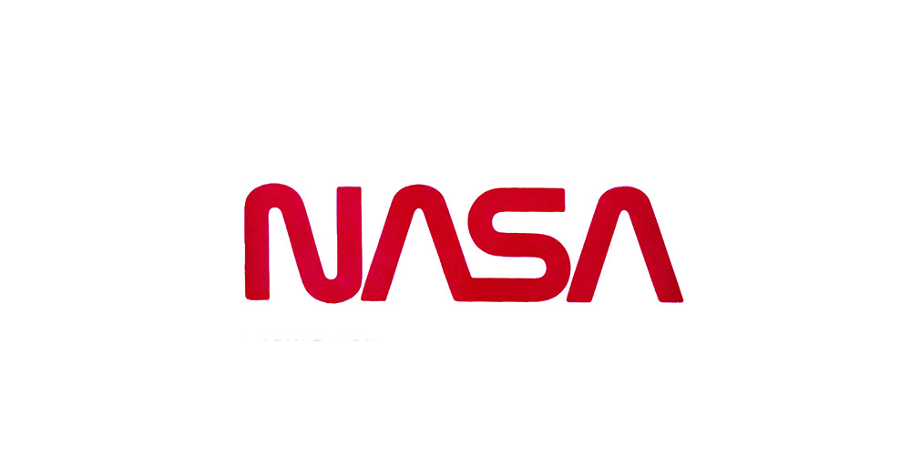
The Worm logo: The logotype, which spells NASA futuristically, has a curved font with no cross bars, displaying a sleek, space-age appearance. Even though it retired in 1992, the logo made a massive comeback in 2020.
More on the worm: It’s presented in capital letters, displays distinct cuts and rounded angles, and forms a flowing one-liner. To continue the “line” effect, both letters “As” of the letter mark logo do not have horizontal bars.
Meanwhile, if you notice, the inscription has a smooth contour, seeming to create that “worm” movement (hence, the name of this logo).
LATEST “Meatball” Logo: Who doesn’t know the meatball design of this administration’s logo? The stars represent space, and the sphere represents a planet. Not to forget, the wing symbolizes aeronautics, with the orbiting spacecraft going around it.
[Fun Fact: Today, NASA uses the worm and the meatball logos. In many cases, the WORM is used alongside the MEATBALL logo, complementing each other and are embraced by space fans.]
Why We Think It’s Special?
NASA’s lettermark logo is clean, simple, and visually futuristic and timeless. Out-of-this-world (space) thinking is evident with the removed crossbars in the “A”, reinforcing innovation.
The Lesson
Even minimalist designs can create a considerable impact, provided you execute them with style.
4. HBO
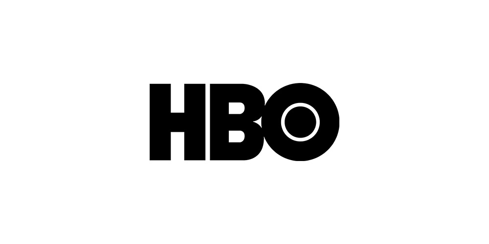
Distinct, minimalistic, precise—the qualities of this letter mark logo. Notice the circular dots inside the letter “O” and the bold letters used. They balance the design, with O creating a sense of visual curiosity, much more like a camera lens or TV screen represented abstractly.
Why We Think It’s Great?
It has significant staying power. Imagine this logo being used for more than 40 years and counting. We also liked HBO's visibility and recognizability, which works on all screen sizes. Without complexity, the “O” is creative, adding uniqueness to the logo and conveying a hidden message of “curiosity” as viewed from a lens.
The Lesson
You don’t need huge design details to make an iconic logo. HBO is the perfect example of a simple lettermark being a significant brand identity.
Check out this guide on tips when creating the perfect letter logo.
5. HP (Hewlett-Packard)
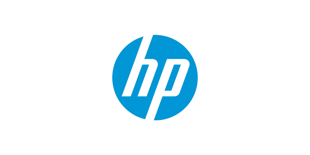
Forward-leaning. The logo communicates a lot of things. Adding an angular and sharp logo style gives a lettermark that conveys speed, tech-focus, and precision. The HP lettermark logo, for example, comes across as intelligent and “present”, giving that feel of being active and modern.
Why We Think It’s Great?
Hewlett-Packard is quite long, so using its initials or this simple abbreviation “HP” is a sound choice. The short logo is highly adaptable across channels, such as product interfaces, packaging, and digital products, while being on-brand because of its consistency.
The Lesson
If you’re in tech, you understand the importance of reliability, and your logo can reinforce that with a contemporary, clean layout and typography.
6. GE (General Electric)
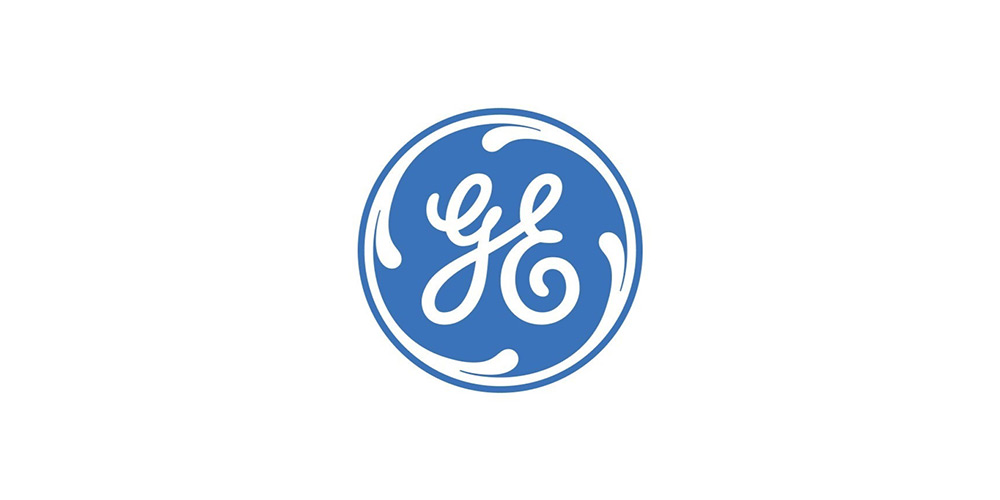
Blending modernity and heritage, the elegant lettermark logo enclosed in an emblem is innovative, combined with the highly creative and energetic “swirling” hand-drawn letters.
While the original logo has undergone several iterations over the years, GE has continued to embrace its heritage. The latest logo, introduced in 2004, featured the same circular badge but with changes to the color. This modern GE logo displays a white and blue badge to convey confidence, reliability, and lightness.
Why We Think It’s Great?
It is an excellent combination of an elegant design that balances the company’s heritage and the circle that adds harmony and completeness. The creativity in the execution of this logo makes it memorable.
The Lesson
The logo's hand-crafted look can benefit manufacturing, engineering, and energy sectors and brands. It simultaneously conveys craftsmanship, legacy, and trust.
7. Unilever
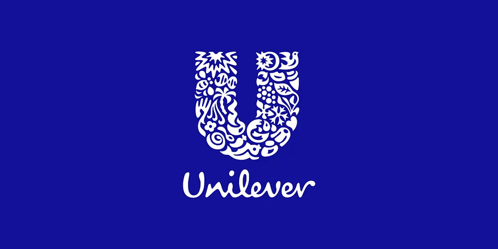
Its lettermark logo appears with a hybrid “U” complete with icons representing nutrition, sustainability, wellness, and hygiene. It speaks much about the brand and narrates its story in a simple logo design.
Why We Think It’s Great?
The logo is more than a pretty face; it has become the brand’s storyteller, conveying its products and values in one. It’s an infographic, with every element inside the letter “U” weaving the brand’s narrative and tying everything back to the company's mission. It is rich visually, but it keeps the clarity we crave when establishing a brand identity.
The Lesson
A well-thought-out lettermark logo can serve as your brand’s ambassador when executed correctly. It can build an emotional connection with your customers while communicating your purpose and story.
8. Volkswagen (VW)
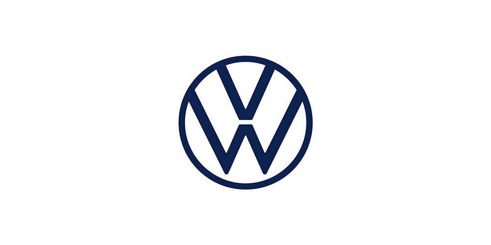
Its logo features a stacked letter “V” above “W”, both enclosed in a circle. It displays a symmetrical and balanced design that symbolizes the precise engineering in VW’s vehicles, which the company is known for.
Why We Think It’s Great?
The color scheme is striking no matter where the logo is displayed, while its shapes or geometric elements show innovation, reliability, and order.
Stuck for ideas on awesome color schemes? We’ve created this guide about best logo color combinations for brands in 2025.
The Lesson
The simple lettermark logo represents the brand’s legacy in the automotive industry without overdoing anything. Companies can consider a logo with structural harmony to build consumer confidence and trust in a competitive industry.
Need tips for the best logo size? Here’s a useful blog we’ve published about logo sizes.
9. Chanel
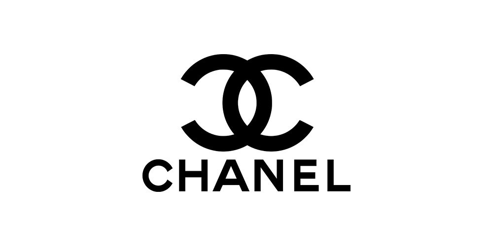
The branding logo used the initials of Coco Chanel, the company’s founder. The interlocking Cs in the logo represent qualities like sophistication, elegance, and luxury, which it retains over the years. So even if logo trends come and go, its logo remains a classic.
Why We Think It’s Great?
This lettermark logo is balanced, instantly recognizable, and perfectly symmetrical, conveying the brand’s primary message of power and minimalism. We believe this type of logo works in many industries, such as fragrance and fashion.
The Lesson
Companies seeking to convey elegance and exclusivity should consider a minimalist design like the Chanel logo, which is consistent and uses sophisticated typography.
10. Louis Vuitton (LV)
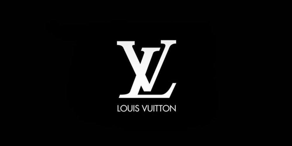
We love this global status symbol monogram (Think LV bags and other luxury items). This logo was designed with stylized serif letters diagonally arranged and repeated as the company’s design pattern in many of its products, representing elegance, tradition, and quality craftsmanship.
Why We Think It’s Great?
This monogram combines a unique arrangement with classic typography and standing out without using imagery. Overall, it reinforces Louis Vuitton’s sophistication and prestige.
The Lesson
You can turn a simple monogram into an exclusive experience, provided you choose the right typeface.
What These Lettermark Logos Teach Brands
Less is more, and every logo detail must be thoughtfully intentional. Despite the minimal and straightforward approach to their designs, they capture each brand’s story and convey their messaging clearly, communicating their values with consistent usage, impactful symbolism, and thoughtful typography.
Start Designing Your Lettermark Logo with Logogenie!
Are you ready to design and create an iconic brand logo? Design a custom lettermark in minutes with our AI-powered logo maker, offering fully customizable color schemes and layouts, a vast library of design elements and fonts, and high-resolution downloads in various formats. Design your lettermark logo on Logogenie today!