![]()
Consumers trust what they see first. Unfortunately, many electricians overlook branding. A professional electrician logo can set you apart instantly, especially in a trade where trust is everything.
Your logo is more than a pretty design. It’s a visual handshake that tells customers you’re skilled and reliable (and always ready to deliver!). Having the right logo establishes and builds your credibility even before you pick up a tool.
Don’t worry. We’ll share ten creative electrician logo ideas, including practical ways to design a logo that sparks attention and builds interest. After all, your brand identity deserves the same care as your craft, whether you’re a one-person operation or a full team.
What Makes an Effective Electrician Logo?
A strong (and memorable) electrician logo is more than a nice visual. It’s your business packed into an influential image.
Do you know what people notice first? Your logo! That’s the power of first impressions, allowing you to build trust and convey professionalism even before a job starts (or a potential client calls for your services). Your logo signals skill, reliability, and attention to detail, BUT only if designed right!
Qualities that Matter
So, what makes a great logo for electricians? Ideally, your mark must reflect your profession’s core values (like precision, safety, and reliability).
A softer, more approachable feel should be more meaningful to homeowners seeking electrician services.
On the other hand, if you work more with industrial or commercial establishments, logos with sharper lines and bold elements are more appropriate (signaling expertise and strength).
Visual Elements
Instantly recognizable imagery fuels today’s logo design trends and ideas (think electrical plugs, light bulbs, lightning bolts, circuit lines, and even electrician tools).
These icons quickly communicate your trade without relying on text. Well-thought-out visuals make complex ideas simple, allowing your audience (and customers) to appreciate you more.
You’ll want simple logo visual elements. You don’t want intricate designs to lose their impact when printed small (for business cards or web favicons) or viewed from afar.
Industry Colors
Color choices help define your brand identity.
For instance, black and yellow suggest high energy (perfect for electricians) and caution (as you’re dealing with high voltage objects).
Blue conveys reliability and trust (customers don’t want their properties to go up in smoke), while orange brings a sense of energy and responsiveness (ideal for electrical emergencies).
The point is that using colors strategically can help your electrician business stand out while reinforcing your message.
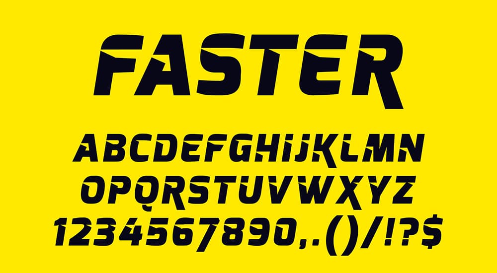
Fonts
Typography matters in any business, and yours should be bold and clean. More importantly, it should be easy to read in any size (so your audiences don’t have to squint to know it’s your brand).
Like colors, fonts communicate your brand’s core attributes.
For example, strong sans-serif fonts communicate professionalism and confidence (just what an electrician must possess).
Softer, rounded fonts offer a friendlier tone (perfect when you’re catering to homeowners).
Overly decorative typefaces can be challenging to read on moving vehicles (like your service van or truck) or even small promotional items (think pens and lanyards).
Placement Matters
Effective logos work across platforms, from business cards, vehicle signage, and billboards to uniforms, invoices, websites, and more.
Ever wonder what’s a responsive logo? It assumes that your logo can adapt seamlessly to different formats to ensure it stays clear and recognizable, whether on a small social media profile or across the side of a work van.
Combining these elements (qualities, colors, visuals, fonts, and adaptability) can produce a logo that works as a round-the-clock brand ambassador. Do it right, and your electrician logo will make your brand instantly recognizable and bring more trust to it. More crucially, it keeps your brand front of mind wherever it appears.
10 Creative Electrician Logo Ideas to Try
It usually helps to see what works in real life before diving into making your own logo. Need electrician logo ideas to inspire you? Here are 10!
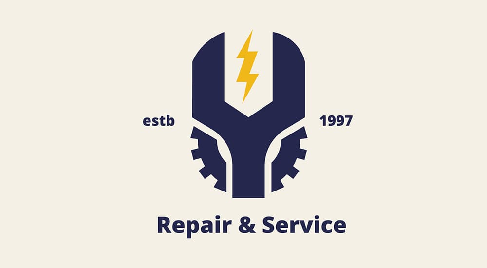
Electrician Logos with Lightning Bolts
Few symbols shout “electrician” as clearly and “energetically” as the lightning bolt. After all, lightning is nothing more than a naturally occurring electrical discharge.
This symbol is instantly recognizable (unless your clients associate it with Thor). It’s universally linked to electricity and is visually dynamic.
Incorporating a lightning bolt into your electrician logo communicates power and speed. It conveys technical expertise.
Such a logo works because it’s bold, simple, and, more importantly to different styles (from retro-inspired to sleek and modern).
1. Lightning Bolt as Main Icon
Did you know that using the lightning bolt as the hero of your electrician logo makes your message crystal clear? Keep it simple and bold, so it’s instantly recognizable from afar.
You can place it above your business name or even alongside it. Some brands incorporate it within a badge-style design.
This logo design idea for electricians works well with minimal typography and clean lines to allow the icon to carry most of the visual weight.
2. Lightning Bolt Integrated into Lettering
A lightning bolt can be an integral part of your text. For example, you can replace the letter “I” with a lightning bolt. Alternatively, the lightning bolt can form the crossbar of the letters “A” and “E.”
You can check out Pilko Electrical’s logo, with a lightning bolt cutting the “P” in a diagonal stroke.
This electrician logo idea is a clever way to blend imagery with typography. It keeps the design compact and cohesive.
3. Lightning Bolt Subtly Woven into Another Shape
If you want to be more creative, you can incorporate the lightning bolt into a different object.
Imagine a lightning bolt running through a lightbulb. It could also form the prongs of a plug. The lightning bolt could even outline a house shape.
This layered approach tells more of a story and shows how you apply your expertise in your job. It’s perfect for responsive logos that look interesting in simplified and detailed versions.
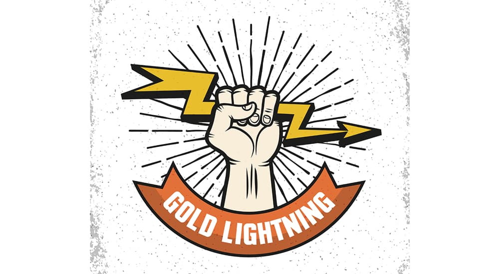
Retro-Themed Logo Designs
Need to convey history and trustworthiness? Try retro-themed electrician logo designs. They work because they convey heritage (perfect if you’ve been in the industry for decades), skill, and craftsmanship. These are qualities that instantly make customers feel they’re in safe hands.
The retro look values authenticity, leveraging vintage fonts and muted color palettes. It can also feature tieless iconography.
Here are 3 retro-style electrician logo ideas to inspire you.
4. Vintage Badge Emblem
Check out Burton Electric Co.’s logo, and you’ll see why a circular or shield-shaped badge with your business name in bold serif or script lettering works.
You can add classic electrical elements, like a lightning bolt (like Burton’s), a plug, or even crossed tools in the center.
Use muted reds and navy blues to give your logo an aged, workshop-era feel. You can even use cream tones.
5. Hand-Drawn Lightbulb Illustration
Try your hand at doodling Thomas Alva Edison’s lightbulb with detailed filaments. Surround it with your business name in curved text.
Make it look like it’s been stamped on an electrician’s toolbox decades ago by implementing a slightly distressed texture.
This logo design idea can create a warm, approachable brand identity (perfect for homeowners) that still feels professional.
6. Mid-Century Typography with Icon Accent
Blocky, all-caps lettering is reminiscent of the 1950s. Pair it with a small icon (like a lightning bolt or a retro plug) off to the side, and you’ll have a memorable logo.
Alternatively, you can combine charcoal gray and mustard yellow to create a color scheme that feels classic but still pops on signage and work vans.
A retro-inspired electrician logo design blends nostalgic visuals with modern adaptability, delivering style and trust.
Professional Wordmark Logos
These logo design ideas focus on your business name as the star of the design. It hinges on typography alone to build recognition.
This approach works because it creates a clean, timeless look that’s instantly legible on everything from business cards to vehicle wraps. Don’t agree? Check out Gibbons Electrical’s logo.
Your company name itself becomes the brand (without extra icons or busy graphics). It makes it easier for customers to remember and refer.
Wordmarks also scale beautifully, and if you study lettermark logo examples, you’ll find this logo idea flexible. It can become a lasting visual signature that’s instantly associated with your business, wherever it pops up.
7. Bold Sans-Serif Impact
Thick, modern sans-serif fonts convey strength and reliability. They also convey your brand’s no-nonsense professionalism.
You can ensure maximum visibility by using uppercase letters and high-contrast color combinations (like dark blue and white or black and yellow). It’s perfect for electricians who want a contemporary, confident brand image.
For instance, Brightline Electrical’s bold, solid block lettering makes an impact. It’s also instantly readable even from afar.
8. Elegant Serif with Minimal Styling
Serif fonts can give your logo a sophisticated look. It will also scream of tradition. They’re perfect for electrician businesses that want to project trust and heritage.
You can personalize the typeface by subtly incorporating a lightning bolt forming the crossbar of a letter or a plug replacing the dot of an “i.”
For instance, Voltman & Co. features a deep navy serif type paired with a gold accent. This logo communicates quality and expertise without sacrificing simplicity.
Creative Icon-Based Logos
Unleash your imagination and creative streak with your own icons. These electrician logo designs use a strong, standalone visual element to represent your business.
This approach works so well because a well-designed icon can communicate your trade instantly and memorably. You can use visuals like sockets, plugs, and wires. And yes, lightning bolts work, too. They’re instant cues that tell your customers what you do without a single word.
Here are two creative icon-based logo design ideas for electricians to inspire you.
9. Abstract Electrical Symbol
Forget the usual bolts and other electrical symbols and use something more abstract instead. You can focus on vague shapes, patterns, and lines to suggest energy and connectivity (even flow).
You can try a circular emblem with curved lines that radiate outward to mimic electrical currents. Alternatively, you can interlock shapes to resemble wiring paths and a power button.
This logo idea design for electricians is perfect for those who want a modern, tech-savvy image (and still conveys their expertise). It’s clean and minimal. More importantly, it scales perfectly.
10. Mascot-style Character
Want to add personality and approachability to your electrician brand? A mascot-style character logo design should be a great choice.
You can have a cheerful lightbulb with expressive eyes or a confident plug giving a thumbs up. Don’t like such mascots? You can try a friendly electrician cartoon holding tools, like that of Harbison Electric.
Need an electrician logo idea design for your residential-centric business? A mascot-style logo should be relatable and memorable.

Fresh Color and Typography Tips to Make Your Electrician Logo Design Pop
Choosing the right colors and typography is as important as the icon or layout of your electrician logo design. You will want to achieve the right pairing to set the tone for your brand while conveying professionalism. We prepared a few logo color combinations (font choices as well) to inspire you!
- Combine yellow and black. Yellow signals energy and optimism (customers will know you’re in the electrical trade). The color black grounds the yellow with strength and authority. This combination produces high contrast, making your logo pop from afar.
- Opt for teal for a modern feel while conveying freshness and trustworthiness (without being overused). It blends the calm of blue with the energy of green, which is perfect for residential and commercial clients.
- You can also try purple to communicate creativity and a premium electrician service. It’s perfect for positioning your brand as a specialist electrician or even a high-end service provider.
- Add gradients to your logo to create energy and depth, especially when moving from warm (orange or yellow) to cool (blue or teal) tones.
- Leverage the clean lines of sans-serif fonts for easy readability. They also give your electrical professional logo a contemporary feel.
- Serif fonts convey trusted legacy, allowing your customers to recognize your craftsmanship from afar. Go for these fonts if you’ve got decades-old family-run electrician businesses.
How to Design Your Own Electrician Logo
Learning how to design electrician logo yourself can be a journey of discovery. It’s actually easier than most think, especially if you follow a clear process. Here’s how.
Step 1. Define your brand personality.
Always start with this to help determine whether your logo should feel modern or playful (or maybe even a tad premium). It’s like laying the foundation for your logo design choices.
Step 2. Choose your style.
Do you prefer a wordmark as a logo? How about an icon-based design or even a mascot-style logo? Why not use a combo of sorts? You might want to match each style’s strengths to your brand goals.
Step 3. Select colors and fonts.
Think about logo color combinations that best reflect your electrician brand. Go teal for a fresh look or yellow & black for high visibility. Serif fonts are perfect for tradition.
Step 4. Pick a symbol or motif.
Want lightning bolts? How about plugs or lightbulbs? Why not transform them into abstract electrical patterns? It will make your logo unique and instantly recognizable.
Step 5. Draft your design.
Sketch a few concepts on paper (or even a graphic tablet app). You can also try an AI logo generator, which is definitely quicker. It also lets you access thousands of professional-looking electrician logo ideas.
Step 6. Test across formats.
Make sure your logo looks great on different platforms (imagine how it looks on business cards, work vans, websites, uniforms, and more). Always aim for a responsive logo that works at any size.
Step 7. Finalize and save.
Export your image in vector file formats, like PNG and SVG, for flexible use.

Tips for Creating a Standout Electrician Logo
Creating a standout electrician logo is much easier when you have the right tools and a few smart strategies in mind. Check out these tips.
- Keep your logo looking sharp (regardless of size). Go for simpler, cleaner shapes.
- Select bold (and high-contrast) colors to make your logo pop. Spotting it from a distance should be a cinch.
- Your electrician logo should look great in black & white and color versions. So, test it in both chromatic styles.
- Design your logo with responsiveness in mind. You’ll want a full version for marketing and signage purposes. A simplified icon-only logo is essential (for uniforms and social media). Ensuring brand consistency across all touchpoints should be easy.
Use Logogenie to make logo design easier and faster. After all, speed is one of the most significant advantages of using a logo maker. You can generate dozens of logo design variations (in different sizes as well) in minutes, then tweak them to fit your brand. You can also create unique concepts quickly (which you can refine to match your brand) with it.
Final Thoughts
A great electrician logo mixes your creativity and clarity. It also conveys your brand’s unique personality. The design ideas we shared should make your own logo creation journey more worthwhile.
Transform your vision for your electrician business into reality. Jump into Logogenie and play with different design elements (colors, layouts, fonts, etc.). Crafting an electrician logo that lights up your brand and sparks instant recognition should be easy with Logogenie. Try it today.