12 Best Vintage Logos and How to Design One For Your Company
Vintage logos take us back in time. Nostalgic. Magical. Even whimsical. No wonder we tend to gravitate toward the past in everything we create. As you may have noticed, we humans mimic what we like (and remember), right?
Vintage art, music, and “the retro” in general feel exciting and “new” at the same time.
So, while “old-school,” vintage logos effectively connect to our emotions. They keep us grounded in our roots, and they make us feel both familiar and distant.
Inspired by past eras, modern yet vintage logo designs are still “in.”
Today, we cover the 12 best vintage logos and steps to design one for your company. Moreover, we discuss who should and who should not use a vintage logo, as well as other practical tips to keep in mind. Let’s get started.
What Is A Vintage Logo?
Washed out colors, vintage images, hand-drawn badges, stamps, and frames. You name it.
The old style or classic logos (based on designs from the 1900s to 1980s) never fails to impress up to the present times because they evoke nostalgia (the smell from mother’s oven, grandma’s cooking, dad’s old Chuck Taylor shoes), reminding us of laid-back times, durable products, and sincere messaging.
If used correctly, these retro-inspired logos take people back to previous eras, making your brand feel authentic (and relatable), building an instant and lasting emotional connection with them.
A modern, vintage logo is characterized by motifs, moods, and styles from the past, like wearing your aunt's embroidered top or grandfather’s leather boots - it has character and history to it (and maybe a bit of adventure “embossed” in it)
Most of the time, these retro-style logos tell a brand story, perhaps mid-century diners or prohibition-era bars, stirring up a sense of nostalgia or adventure instantly.
The Jameson Irish Whiskey logo is a great example of this. It conveys craftsmanship and heritage at the same time. At a glance, it tells consumers that it’s not just an alcoholic drink but also a part of history.
What Are the Key Elements of a Vintage Logo Design?
A modern logo is future-focused, minimal, and sleek, highlighting innovation. In contrast, vintage-style logos are often textured, detailed, and story-driven (and again, nostalgic). They emphasize standing the test of time - rich and aged in character.
Think of leather-bound books versus an efficient and polished ebook reader. You can tell the difference.
In a nutshell, vintage designs use classic elements, such as visual motifs:
- All-caps trademark-style font/text
- Decorative flourishes and borders
- Anchors, ropes, barley, compass, wildlife, and other rustic symbols
- Hand-drawn/script style fonts
- Rough edges and faded textures
In terms of color palettes, vintage designs use muted colors (no neons). So, if you notice, they’re designed using monochromatic and earthy colors (yellows, reds, black-and-white, and mustard tones).
Who Should Use a Vintage Logo?
Vintage tells a story and connects to human emotions. It works well when your story is about craft, roots, heritage, and trust. But while they can work in many industries or settings, they tend to be more effective in the following:
- Liquor companies (gin, whiskey, craft beer);
- Distilleries and breweries (e.g., local craft)
- Tattoo studios
- Interior design firms
- Restaurants
- Diners, cafes, and bakeries (feel-good, cozy)
- Barbershops
- Clothing brands (outdoor, rugged, heritage lines)
When to Skip Vintage Logos
If you’re in industries like artificial intelligence (AI logo makers), digital security, innovation, luxury fashion, space-oriented brands, high-end cosmetics, scientific or medical fields, or cutting-edge technology, skip a vintage emblem or logo. After all, would you trust a cybersecurity agency whose logo looks like it was established in 1910?
12 Most Popular Vintage Logos of All Time and What Makes Them Special?
Let’s highlight the best vintage logos for inspiration.
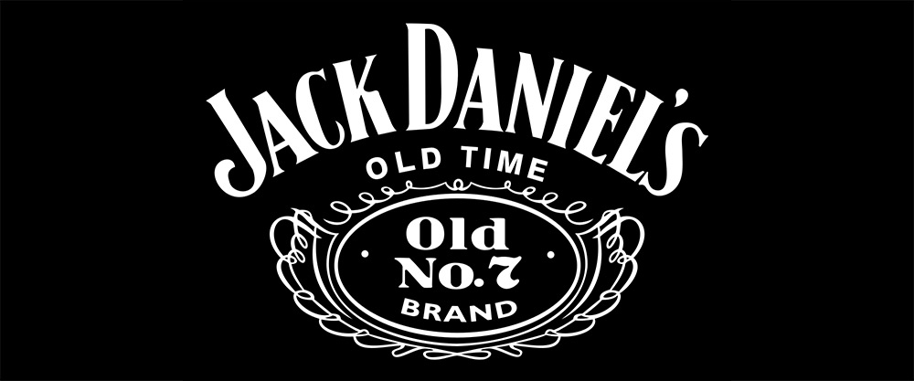
1. Jack Daniel’s
Black-and-white, a classic. No question. That’s exactly what the Jack Daniel logo is all about: a timeless design. The text is minimal, the background is ornate, and the font is classic serif. These elements have not changed for over a century, making the logo recognizable but never outdated.
Trivia: Why Old No.7 Brand Tennessee Whiskey? There are many arguments behind it. Others say that “7” is Daniel’s lucky number; others claim that this number is to honor his 7th girlfriend (being a lady’s man); and the rest argue that it was the 7th recipe attempt that became successful.
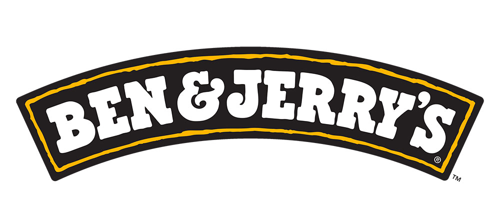
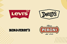
2. Ben & Jerry’s
Okay, this 1998 (to present) logo doesn’t communicate vintage with the absence of heraldic elements and aged textures. Yet, it has a vintage charm. It’s full of character.
The lettering is chunky and fun, pulling from 1960s counterculture and classic Americana (playful and handmade) for that feel-good (and nostalgic) brand identity.
The updated logo features a recognizable and minimal design, which marks the company’s 20th anniversary. It has the brand’s moniker in white font on an arc-shaped black background.
On the other hand, the curve conveys the protection the company gives to its products.
The logo’s “handwritten, imperfect” presentation, which leans into a counterculture aesthetic, conveys the brand’s approachable and friendly personality. It is a signature appeal of vintage logos, a design reminding people of farmers’ markets, local general stores, and handmade goods.
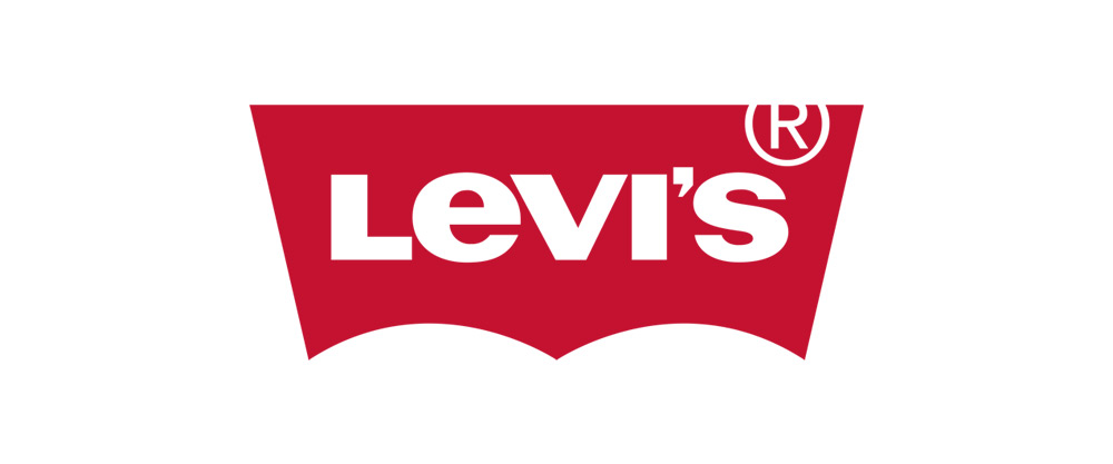
3. Levi Strauss
Strauss & Co. needed a memorable icon or image, which consumers could easily recognize when they go to the store and look for the pants with the “two horses.”
The 2-horse logo, with two horses pulling a pair of jeans in the opposite direction to rip them apart, represents the strength and quality of the Levi’s jeans and makes the brand easily recognizable.
It has successfully served its purpose because it has helped the brand build a reputation that its products are dependable, strong, and high-quality.
Indeed, the brand’s image (a rugged Americana) is still stitched onto Levi’s products, like jeans and clothing, linking many generations through hardworking, simple, and distinct designs.
Some cool bits: 2 Horse Brand was Levi’s original company name until 1928, when it started using the Levi’s® trademark. Still a powerful messaging tool (2-horse logo) as it was 125 years ago.
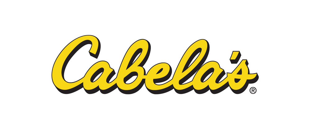
4. Cabela’s
The company is known as one of the world’s top retailers of outdoor gear as well as hunting and fishing supplies.
One look, and you can say that its logo screams American outdoor culture! It gives us the feel of the 1970s vibe (wooden porches, summer retreats, and things you can do outdoors), reminding us of an easy lifestyle.
The logo’s appeal lies in its cursive typography, bright yellow color palette, and subtle fonts, all giving that classic feel it deserves.
The hand-drawn, cursive script evokes a sense of tradition and gives the logo a personal touch, almost like it’s a signature from the founders, Richard N. Cabela and Jim Cabela, conveying years of expertise, communicating trust, and giving us gives us a sense of reliability.
Overall, Cabela’s is proof of a vintage logo’s effective storytelling (rugged adventure, heritage, and trust) that connects with human emotions instantly.
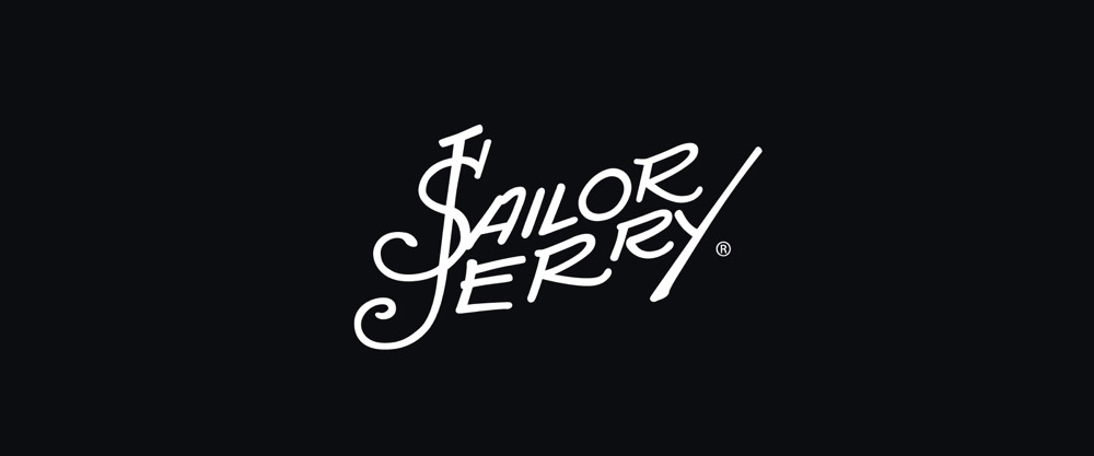
5. Sailor Jerry’s
Rebellious edge. Nautical motifs. Vintage illustration. Sailor Jerry’s logo has all the elements to be identified as a vintage logo, which is inspired by old-school tattoo art.
It features a vintage-style and bold typography and symbolizes a maritime aesthetic. The name of the company is presented in a stylized script font. It’s slightly arched, and we can say, fluid, evoking a sense of movement.
The color scheme is black, giving the design a striking contrast against the logo’s background. And speaking of maritime aesthetics, there’s an anchor, which, while it’s an illustration, doesn’t intrude on the design nor give it a cluttered look. Instead, it’s subtly integrated into the design.
Overall, the logo’s use of nautical imagery and textured appearance makes it one of the best vintage logos of all time. Its design communicates craftsmanship and a sense of history rolled into one, appealing to fans of traditional tattoo styles and the sailor culture in the US.
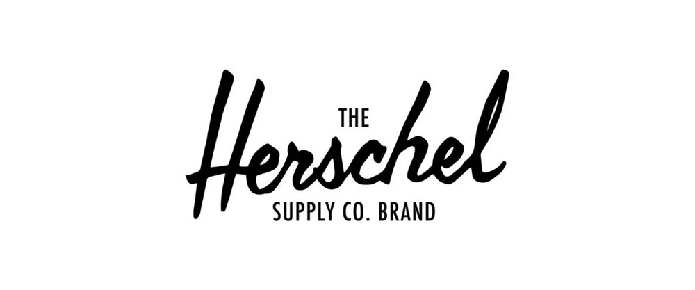
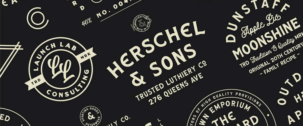
6. Herschel Supply Co.
Jamie and Lyndon Cormack founded the company in 2009, adapting the name of the town of Saskatchewan, where the Cormack family was raised. It first opened its stores in Vancouver, B.C., and is known for producing classic and timeless utility and travel products, like everyday bags and travel bags, which stand out for their interesting and fun designs, combining a sense of modernity and nostalgia.
Its logo has the same appeal, shown with a layered text hierarchy for great visuals that guide the eyes, a core graphic design principle reflecting the style of heritage supply brands.
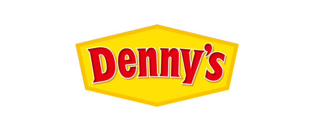
7. Denny’s
With a typography that mimics mid-century roadside signs, the Denny’s logo can certainly take you back in time! Retro diner vibes, anyone? See the welcoming script and bold yellow and red colors.
In 2019, the iconic chain of American cafes introduced a monochrome logo version, featuring a similar hexagon base from previous designs and an arched name (serif font in red) in the middle.
Red is in the border surrounding “Denny’s” and neutral white in the background, allowing the name to pop. So, while the logo is an updated version, it maintains a familiar feel.
[Denny’s, which is known for its family-friendly diner atmosphere, started selling only donuts before it became a coffee shop, and then a cafe with a full menu (and kitchen). Many branches are open 24 hours a day, making it the go-to cafe for travelers and shift workers.]
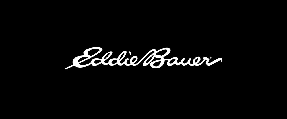
8. Eddie Bauer
Its logo is a testament to its colorful and storied past - with its elegant script filled by the founder’s spirit.
While it has undergone iterations over the years, the brand’s vintage logos are easily identifiable with “subtle yet distinct elements,” whispering timeless craftsmanship, expeditions, and the outdoor culture.
The vintage logo (1920-2023) features the founder’s signature in an easy, flowing cursive style. It was displayed throughout the company’s history, adding depth, a personal touch, and character to its products.
Overall, the script-style logo feels personal, allowing it to connect (and linger) with the emotions of anyone who sees it. The handwritten style, with slight imperfections, is very human and evokes a passed-down spirit, adventure, and trust.
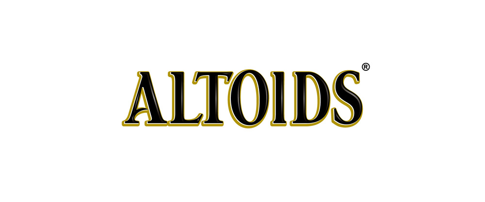
9. Altoids
"The Curiously Strong Mints” - Altoids! Consistency in branding is what it’s known for.
Throughout the years, the company’s identity has been rooted in vintage design. Its logo and product packaging have not changed much. That’s iconic.
The logo’s typeface reminds us of old printing press style, coupled with the use of structured letter spacing, embellished serifs, and capital letters, giving it that early apothecary or Victorian-era vibe, communicating trust, which it has worked hard for over a century.
Another element typical of vintage logos is ornate border framings. That’s exactly what Altoids uses in its logo design you can see in its mint tins, resembling product packaging way back in the 19th century, like medicine labels, adding that “certified” vibe.
Nevertheless, the Altoids logo evokes emotional familiarity, keeping the curiosity alive for its customers (new and old ones). It feels historical and authentic, creating trust with a product that looks like it has been around as far as people can remember.
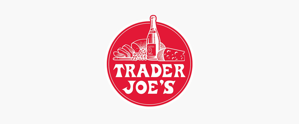
10. Trader Joe’s
Stocked with unique items and people’s everyday basics, Trader Joe’s unique offering isn’t the only interesting thing about it.
Ah, the farmer’s market feel, fresh goods on a Sunday morning. The grocer wants to preserve this “retro” feel in its logo design (old-school, community vibe), while communicating the grocer’s unique, trusted, and local products.
The logo has a simple color palette and straight-edged font style, reinforcing that established and approachable personality.
A little trivia: Did you know that Trader Joe’s is the first to introduce reusable bags? Yes, it’s the first grocer to offer reusable bags in 1977, with the phrase “save-a-tree” printed on them. Interesting, isn’t it? Their reusable bags are still sold in stores.
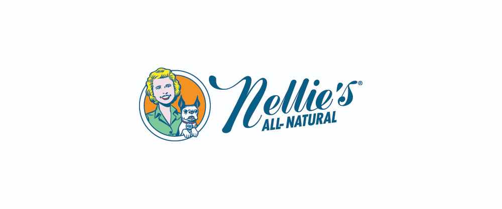
11. Nellie’s
Homey, motherly.. The company’s logo creates a homey feeling and illustrates a nurturing mother figure. Great branding.
Nellie’s cleaning products feel like home (grannie’s secret cleaning product recipe - no harmful chemicals), honoring our ancestors’ ways of simple yet effective cleaning and living.
Its logo - with a friendly illustration (1950s homemaker figure) and soft retro colors, conveys a caring (and gentle) brand personality. Everything in the design feels old-fashioned, loving, warm, and trustworthy. It reflects a 1950s style for its cursive font and Nellie’s mascot.
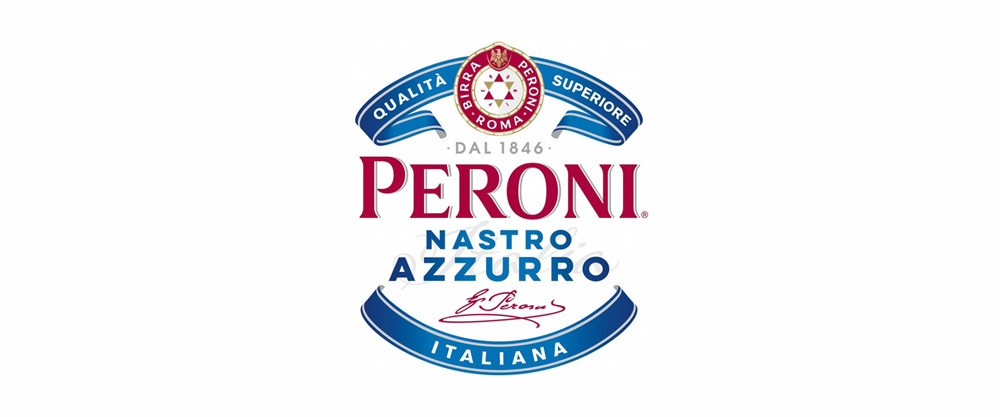
12. Peroni
This logo, more than capturing the past eras’ feel, screams European history and “premium” (without being flashy). Through traditional design, it narrates the brand’s legacy and story, while balancing readability and visual richness.
The Italian beer brand indeed succeeds in vintage logo design, combining national pride, elegance, and old-world charm, with its history dating back to 1846 when Francesco Peroni introduced it in Vigevano, a small town near Genova in Lombardia, Italy. Its first beer, Nastro Azzurro ("Blue Ribbon" in Italian), was launched on the market in 1963.
Giving the logo its time-honored and regal feel - laurel leaves, heraldic ribbons, and traditional Roman lettering, and the formal insignia whispers “heritage.”
The logo displays capitalized, serif, and strong typeface that looks like Roman-era carvings. Meanwhile, the colors navy, red, and gold palette feels refined and classic, reinforcing its European roots.
Overall, the logo transports people, reminding them of generations and generations of traditions, Mediterranean summers, and Roman craftsmanship in every sip! It communicates legacy through every detail.
Other Modern Vintage Logo Ideas
Feel more inspired with these logos.
- Boa: Vintage fonts, neon pops
- Frankowitsch: European cafe charm, pastel colors
- Farm Boy: Rural roots, sketched look
- Aster and Golden: Bold block letters, industrial vibes
- Farmers Union: Muted and rustic colors
- Butters Bakery: Handcrafted style
- Caffeine Tattoo: Old-school typography
- Open Bar Tavern: Tavern-inspired mood and hand-drawn text
How to Design a Vintage Logo for Your Brand
Create a vintage logo design for your brand with these steps.
- Research and study what makes vintage logos feel timeless and memorable.
- Create a visual catalog (textures, motifs, and fonts) for a solid idea of what you’ll need.
- Choose a font (bold, block letters, or cursive letters).
- Pick an earthy and muted palette. Avoid neons but go for faded reds, deep greens, and rustic browns.
- Use symbolic elements that tell your story (e.g., mountains, anchors, ropes, vintage tools, wheat).
- Add a container, frame, or shape (e.g., stamps, badges, or crests) for added authenticity.
- Create a tagline that narrates your brand story.
- If your company has a long name, consider creating an icon or monogram version of your logo, ensuring it looks great on merchandise, caps, or labels.
Tips
Consider your audience! If your market is a tech-savvy audience obsessed with the future of AI and technology, a vintage logo may not work well. Meanwhile, if your audience values traditionalism and loyalty, a retro design is perfect.
Tell your story in the design. After all, vintage is all about emotional connection and relatability. Do you want to capture a sense of adventure? Or perhaps evoke a feeling of nostalgia?
Think about a particular period you want your logo to represent when choosing your font. Look for retro photographs, old signs, or even black and white movies, which should help you pick the right font.
Pick vintage color combinations and palettes. If you notice in the designs we’ve highlighted earlier, vintage logos often feature a part of the design that pops (e.g., Denny’s name in red). In addition, vintage palettes don’t have bright neons or modern gradients, but earthy, aged, and muted tones for a worn-in, warm, and nostalgic vibe.
Design a richly detailed icon, a characteristic of vintage logos (e.g., explorers, wildlife, depicted natural scenes). For instance, a handlebar mustache capturing the vibe of a 19th-century parlor can be a good choice if you own a barbershop needing a vintage feel to it.
Design Your Logo in Minutes With Logogenie AI Vintage Logo Maker
Bring your ideas to life with our AI logo generator in three steps.
- Enter your company details, and Logogenie will create hundreds of templates in seconds! Filter your criteria to help you select the right logo template for your business.
- Design a vintage logo with your choice of colors, fonts, and layout using our online logo maker.
- Download your logo in HD formats once satisfied.
You can also use our intuitive design tools to create branding materials, like email signatures, letterheads, and business cards.
Final Thoughts
Tell your story with a vintage logo, whether you want to capture heritage, history, or culture, to tap into nostalgia… a journey back in time and connect with your consumers on a deeper emotional level that modern styles might not deliver.
Explore and feel free to experiment until you finally design a logo that you and your audience will fall in love with. Enjoy the process and use our intuitive, easy-to-use AI logo maker for ideas and inspiration.
Try Logogenie today to create an impactful business logo for a brand that feels storied… like it has existed forever!