Building a memorable brand isn’t accomplished overnight. Look at Adidas. Before it came to be the global brand we recognize today, it had humble beginnings and a colorful story.
Adidas evolved, so did its logos (yes, more than one). And if you ever wonder how it changed over time, check out this article. Let’s find out how the logo has evolved since the first one (and how Adidas rose to fame and became one of the top multinational companies in the sports apparel and footwear industry)
Origins & Rise to Fame
Did you know that the global brand we know of today started in a washroom? Yes, Adidas has humble beginnings.
Adolf (Adi) Dassler and his brother, Rudolf (Rudi), registered the shoe business ‘Gebrüder Dassler Schuhfabrik’ (1924), creating the “Dassler Brothers Shoe Factory.”
Adi set out to provide sportsmen and athletes with the finest equipment. He lived his life in Bavaria, Germany, where the company began and where he created his first set of shoes by hand.
By 1925, their startup, which, during that time, had only three employees, started producing football boots and spiked track shoes.
Currently, the multinational corporation remains in the small town where Adidas designs and manufactures its athletic products (e.g., sneakers).
With hard work and dedication, the company rose to popularity, and later it became the number two athletic shoemaker globally, next to Nike.
In the 1936 Summer Olympics, Adidas made history! The brothers found the perfect opportunity in the international sporting event that took place in Berlin and thought that Jesse Owens, a sprinter from the US, would be the perfect ambassador to introduce it to the world.
Adi approached and offered him a pair of track shoes while competing. The Olympian accepted the kind gesture and decided to wear the Adi-designed sneakers.
His performance was phenomenal - the first ever American to win four Gold Medals in track and field (100m, 200m, 4x100m relay, and long jump), sealing his place as the most successful athlete in the 1936 Olympic Games.
The publicity was everything that Adi and Rudolf needed after all!
Leading up to World War II, the company’s sales reached almost 200,000 pairs annually, with huge orders for hockey, baseball, and basketball shoes.
In the later years of World War II, American soldiers came through and recognized the shoemaker company to be Owens’ provider, allowing it to stay operational (and even US soldiers became customers themselves).
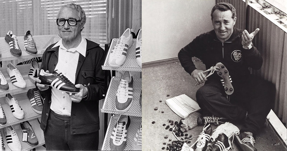
The Family Feud: Dassler Brothers Split in 1948
The brothers’ relationship wasn’t without challenges and misunderstandings. Despite success, war and family-related stress caused a rift between them.
The German government, when World War II began, allowed Adolf Dassler to keep making shoes. Rudolf was upset about not being given the same courtesy as his brother.
This enraged Rudi, believing his brother was happy to run the company by himself and profit from the same while his life was on the line (being drafted).
The two became disconnected, with the war and the negative relationship of their wives contributing to their rift.
Finally, they decided to split the business in 1948, dividing everything, from earnings, staff, and equipment. And as almost everyone in Herzogenaurach worked for them, hence divided the whole town.
Adi renamed his company side “ADIDAS” (a combination of his nickname and last name. Rudolf established his new firm, Puma (formerly Ruda).
[FACT: Until 1987, Adidas remained under Adi’s ownership and control. Since then, it has had ownership changes and has become a major sportswear maker in Europe. Today, current CEO Bjorn Gulden leads Adidas, which belongs to the Adidas AG Holding Company.]
The feud led to a full rebrand.
Obviously, Adi would need an updated logo to establish a new identity and differentiate it from the old one.
SUMMING UP: World War II got in the way of Adi and Rudi’s good relationship. They were forced to join the German Military. The former returned early, and the latter ended up in the prisoner-of-war camp. This event led to a violent disagreement and quarrel, ending their relationship and business, thus the birth of Puma, the company Rudolf started. In 1950, Adidas was born - they became rivals. Both companies have headquarters in their native town.
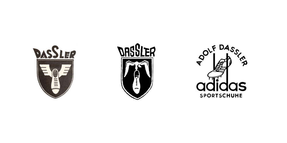
1949-1950
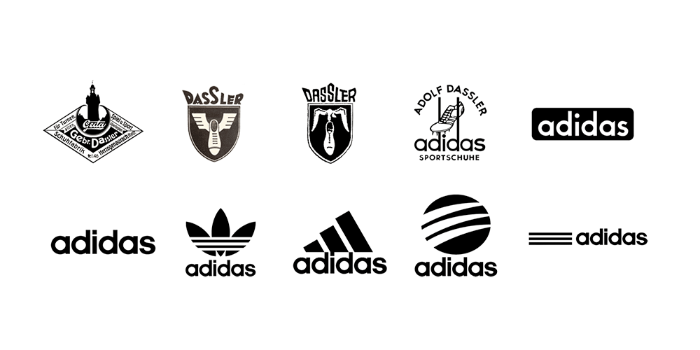
When the shoemaking company of the Dassler brothers started, they only sold sports shoes, and their first logo represented their brand - a shield-shaped logo wherein a flying bird carried a shoe.
The first official Adidas logo, on the other hand, was designed with Adi’s full name at the top of it and the new brand name “Adidas” at the bottom (with “sportschuhe” or sports shoes ). The middle symbol was a shoe with “spikes” on the side, with it placed between two “d” tails from the word Adidas.
The 1949 logo featured a track and field shoe with the company’s signature branding, which is still visible in many of their logos - the three stripes - sitting between the two letter “d’s” extended tails, with the term “Sportschuhe” added under the name Adidas.
Oftentimes, the brand’s logo appeared in blue, its classic color. For the font, it displays lower-case letters for the company name (always the case), conveying the brand’s personality - a laid-back one.

1950-1971
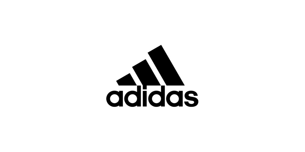
From this point up until 1971, the company started using a minimalist logo, ditching the cluttered elements (symbols, icons, and crest).
For this Adidas logo, it kept its lowercase “adidas” name against a black background, giving the logo a new look (and the brand, a fresh identity).
The font retained the previous look in other logos, but a bit thickened for emphasis and visual effect.
This logo uses a monochromatic color scheme, which the company maintains throughout the years, be it iconic blues or black and white, although in future marketing campaigns, Adidas would use other colors and themes like a “rainbow.”
The wordmark logo only captured its name - appearing across their products, channels, and platforms. The simplified logo design conveys their quality products to help improve athletic performance, speed, and power.
1967 to Present
Adidas kept iterating its logo, although retaining the primary brand elements, including the lower-case letters.
For this logo, it is designed with inverted colors and removed frames. In the case of the font, the company used a particular sans-serif (ITC Avant Garde Gothic), giving the brand a modern look matching its bold and “more thickened” stripes.
Other morphings were the shortened “d’s” and blunted “a’s”. Meanwhile, the previous dot just above the letter “i” was changed into a square. Thus, this version is simpler, more compact, yet more effective. Adidas still uses it in many of its branding materials.
1971 to Present
Then came the “trefoil” logo, another milestone for the brand.
Who doesn’t recognize it (especially for sports fans)? It’s designed with a three-leaf shape (trefoil plant with intertwined leaves) + the three stripes at the bottom half + the brand name at the bottom.
The company started using this logo for its apparel in 1972 and for its footwear in 1976.
The trefoil is said to represent the brand’s vast product offering, from lifestyle, sports, and leisure products, with the three leaves symbolizing Asia, North America, and Europe - symbolizing branching out and global reach.
It’s a “cultural icon” as seen in many products that celebrities, athletes, retro-fashion lovers, streetwear fans, and hip-hop artists wear today.
1991 to Present
The brand is all about overcoming hurdles and outperforming the competition, as shown in its colorful history and beginnings. In addition, it strives to be there for athletes, who, in essence, try to dominate in their fields - every step of the way (in the tracks or not).
The company reintroduced the stripes in its new logo. This time, they’re thick parallel lines (stripes), representing strength.
These lines show a stylized mountain with three parallel stripes, a primary design element from then to the present, but this time, Peter Moore added more weight and power to the logo, with the stripes rotated and bolder than ever.
The “Equipment” logo, which, according to the company, represents “challenges to face” and “goals to achieve.” Adidas wants it to serve as a motivation for athletes, who must face (and tackle) obstacles with all their might.
While this 1991 mountain logo was created for the Equipment (EQT) line, it’s being used on Performance line products as well.
Badge of Sport (Three Bars): Today, you can see celebrities, endorsers, athletes, and sports fans wear shirts, pants, and footwear that display the badge of sport, one of the signature logos of the brand.
FACT: Peter Moore, an American graphic designer, is well-known for his iconic work in the sports industry. One of his famous creations is the original Air Jordan Wings logo (Nike). Moore modernized Adidas’ identity - creating the EQT line (Equipment) and its logo.
2002 to Present: The Striped Sphere Adidas Logo
Then came the 2002 logo (with the bars contained in a circle), known for its “curved white stripes” inside a circular black design resembling either three pathways receding into the background or an animal scratch.
As always, the three stripes are present, but this time with a stylized look highlighted by the diminishing ends arching towards the right portion of the circle.
The iteration of the signature bars displays an organic shape. The company kept the original font and flat aesthetics for this logo, which is used for the Adidas Style line.
This logotype remains on a single plane and is two-dimensional.
It conveys speed and movement, two distinct qualities of the brand, but it’s used more for lifestyle rather than only aesthetics, as featured on daily wear or streetwear collaborations.
But even if the logo has gone through several iterations, its main features remain, and we can still see many such classic logos on many Adidas products.

2005 to Present: The Minimalist Logo
The company introduced its horizontal bars logo, displayed with three clean, parallel, and simple stripes, symbolizing modernity and speed (and mark tracking), and highly adaptable to different placements that include app icons.
Compared to the previous logos, it is apparent that this one is made to be more modern and simpler. Still, it includes the brand’s signature design element - the three stripes. The abstract logo, presented in a simpler version of the previous icons, conveys athleticism and performance.
The Story of the Three Stripes
“The three stripes are a classic brand symbol that became the cornerstone of the company’s branding.”
But, did you know that those stripes weren’t chosen for nothing?
Adi had chosen this design element for their footwear because he discovered that they appeared best in photographs (and promoted instant recognition for athletes wearing it) after testing a couple of versions.
Up to modern times, the stripes are still the brand’s primary design element, which, the company believes, helps boost brand recall, capturing the attention of its consumers, and represents performance, perseverance, and power.
In case you don’t know yet, the three stripes were originally only two stripes. Adi stitched them on the sides of their shoes, symbolizing tandem with Rudi while also securing the construction of the shoes.
Adi kept the stripes to be the brand’s distinctive element when he started Adidas. However, he wasn’t allowed to use the Dassler brothers’ logo. Hence, he added the third stripe and made the three more recognizable and “highlighted” so people could easily see them from the stands.
But one problem: Karhu, a Finnish sports brand, was already using the three stripes in its footwear. Coming up with a brilliant idea, Adolf didn’t stop and bought the mark from Karhu for a few thousand Euros (1,600 Euros today)…and wait, for TWO BOTTLES OF WHISKEY.
Later, Adi’s innovative cleats with replaceable spikes (depending on the weather conditions) were worn by the national team during the 1954 FIFA World Cup.
During the event, rain started pouring. Adolf, who was present, replaced the national team’s shoes with different ones so that they would adapt to the wet turf. This improved the performance of the athletes, giving them a solid advantage over their rivals who continued to play with their cleats. The German team won (also called the “Miracle of Bern”).
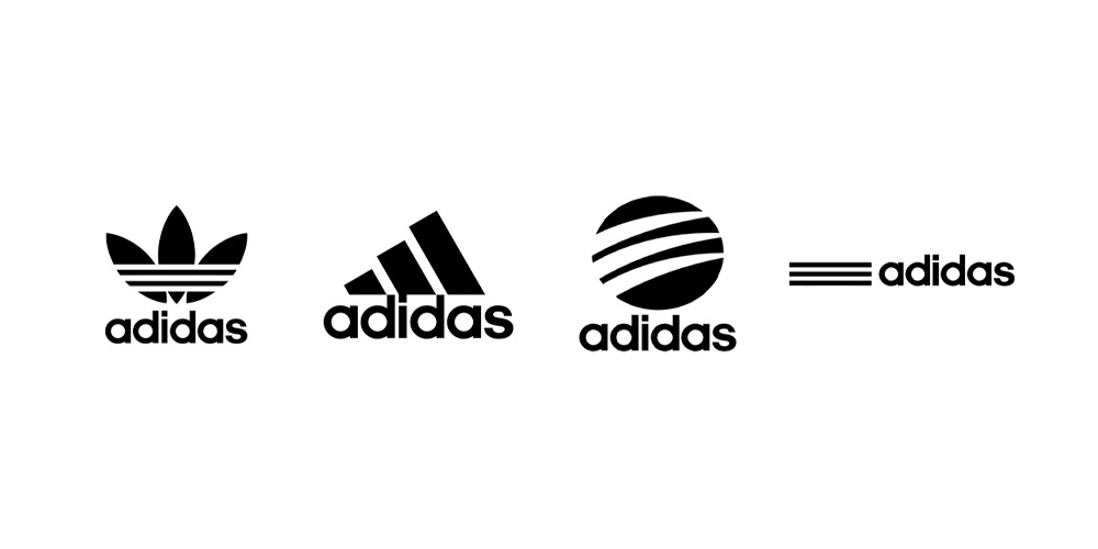
The 4 Logos: Making the Brand’s Logo EXTRA Special
The Adidas logo is proof that powerful branding is both memorable, timeless, and relevant, regardless of the changing times.
Despite the iterations that the Adidas logo has gone through over the years, the company remains consistent in its logo design and branding, especially with how it uses its emblem, icon, or logotype to serve as a marketing tool that lingers in the minds of consumers and makes Adidas the global brand that we know today.
- The “three stripes” are displayed across their product lines, making it synonymous with the brand.
- Trefoil is used with the three bars or three stripes for their Originals (their line of more relaxed shoes and apparel lines)
- Bar (mountain logo) is displayed in its Performance product line. It’s the foundation of the company’s athletic line, representing facing challenges and achieving goals.
- Circle, which is used in the Style line, is a stylized version of the Adidas logo and represents the trendy and fashion-forward appeal of the product line.
Lessons for Modern Logo Designers
Here are the lessons from the Adidas logo.
Flexibility & Scalability
Bars for modern designs, Badge of Sport for performance, or Trefoil for Originals - the company proves that your logo can be in different versions for flexibility and specific markets.
Aim for a logo that works in many contexts and looks good on web pages, social media, merchandise, business cards, or product packaging.
After all, an elaborate logo with fine details may look perfect on billboards but will instantly lose its legibility when reduced to the size of a favicon. Go for a scalable logo with strong but simple shapes that can retain legibility whether scaled up or down.
TIP: Test your logo at different sizes and in colors, including black and white, for visibility and scalability before finalizing your design. You can always use our logo maker for ideas and help in designing a scalable logo.
Simplicity
A simple logo is lasting and memorable, never fading or going out of style. Clean, bold, and minimal designs are recognizable in any placement. You won’t also lose your logo’s clarity and impact even when resized or printed in one color.
Symbolism
Symbols carry meanings! The elements in the Adidas logo represent attributes, such as progress, power, speed, and motion.
For instance, the mountain in the Badge of Sport represents overcoming hurdles and achieving goals (ambitions), while Trefoil symbolizes heritage and diversity.
Consistency
The “three stripes” remain at the core of Adidas' logo designs, no matter how many times the company has updated its brand logo over time. Thus, stay true to your brand identity and personality even if you make small tweaks to your design, meaning keep what customers know (and love) you for.
Final Thoughts
The evolution of the Adidas logo is the perfect example of consistent branding (three stripes), teaching marketers, designers, and entrepreneurs that a clever design can always stay ahead of the game.
The three stripes have stood the test of time, represented the brand’s huge cultural impact (fashion, sports, lifestyle) for almost a century, and carried meanings like progress and ambition.
The moral of the story? A memorable logo isn’t all about aesthetics but something more. It adapts with time and remains true to a brand’s core identity. So, what are you waiting for? Be inspired and get started designing a logo with Logogenie AI logo generator today!

