If there’s one name that constantly reigns as the best in its category, Amazon is it. This marketplace is our go-to for wellness products, groceries, and even TV shows!
It’s the brand millions of consumers trust. Did you know that it ships 1.6 million packages daily?
We can virtually (and literally) buy anything we need here, too.
Thanks to the Amazon logo, which has built brand awareness and recognition globally! So, today, let’s celebrate the colorful story behind one of the most successful brands (and recognizable) logos - Amazon’s, from its first designs to its current look and how it helped shape and define the brand, as well as the lessons it teaches millions of brands.
A Brief Look into Amazon’s Humble Beginnings
Meet Amazon (formerly incorporated under the name “Cadabra”), a company that started as an online bookstore in Seattle, Washington.
Its name was from the Amazon River, the largest river in the world, symbolizing Jeff Bezos’ vision of Amazon becoming the largest bookstore on earth.
Bezos formally launched it on July 16, 1995 (a year after founding it in his garage), with his $10,000 and his parents’ investment.
The company exploded in popularity two months after its launch, making $20,000 in weekly sales and shipping books to all 50 US states and other countries.
Fast-forward, the company became one of the most influential global companies, touching almost everything (even some insanely weird stuff like a rubber chicken purse, UFO detector, and pizza socks).
And as of 2025, its sub-brand “Prime” has an estimated 220 million paying subscribers worldwide, becoming the most extensive paid retail program in the world.
Amazon Logos Through the Years
How the Amazon logo has changed over time? Here is what you need to know.
Original Amazon Logo (1995-1997)
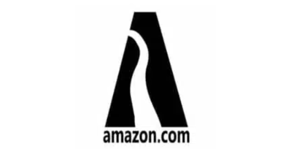
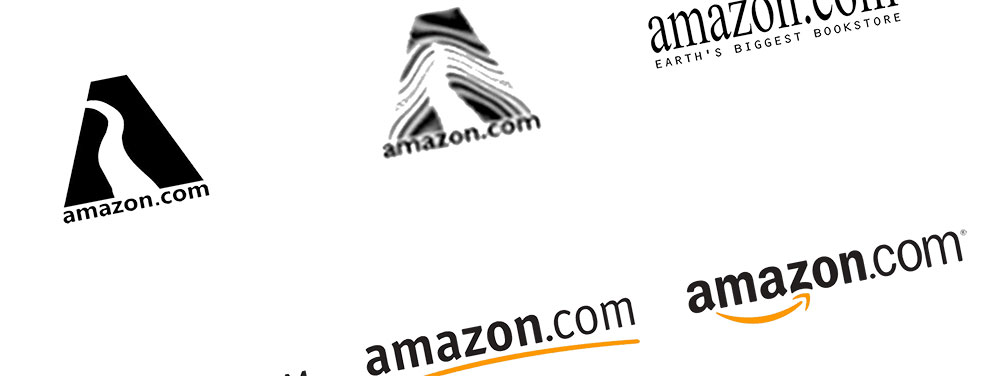
When looking at the Amazon logo history, we have to know its beginnings. The Turner Duckworth design is known for its bold letter “A,” which highlights a vertical white line symbolizing the Amazon River.
A wordmark “amazon.com” was added beneath for easy identification.
2nd Amazon Logo Version (1997-1998)

This design, again, featured the letter “A” with a twist! This time, it included multiple white horizontal lines, an idea from the solid vertical line representing the Amazon River.
These lines resemble different things, apart from the river, including a zebra and a tree, making the Amazon logo memorable.
The second version used a monochromatic color scheme with another color, “yellow.” It retained the wordmark of the first design but enlarged the letter “O.” The tagline “Earth’s biggest bookstore” was removed.
3rd Amazon Brand Logo (1998-2000)

The company went through and tested multiple logo iterations in 1998, which all used the bold letter A monogram as in the other logos; the first one was simply “amazon.com” with the tagline “Earth’s Biggest Bookstore,” with the serif typeface and colors black and white.
Amazon kept the final logo tested until 2000, featuring lowercase letters with a “yellow” swish line under it. A slightly curved line was used to showcase bringing the past and future together. It also used the font Officina Sans for the first time.
And with a huge smile, Amazon introduced the logo we love today in 2000…
2000 to Present: Amazon Logo Design
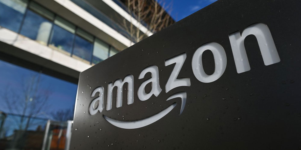
The design kept “Amazon” and removed the “.com. " It uses all lowercase text and a bright yellow-orange arrow connecting the letters “A” to “Z” (smile), representing that the company sells everything and anything. Need more inspiration to design your own letter logo? Read more about letter logos here.
Then, there is Amazon Prime. Its logo features the same design for the word “Amazon,” only with “Prime” added, highlighting a blue color, symbolizing excellence, friendliness, and speed (all traits of Amazon).
Breaking down the modern Amazon logo…
- Color: Black text with an orange arrow
- Arrow: It stretches from A to Z, symbolizing the company that sells everything.
- Font: Bold, clean, and modern Officina Sans Bold sans-serif typeface.
- Smile: The slightly curved arrow appears like a “smile,” evoking happiness, friendliness, and POSITIVITY.
The Amazon logo is memorable and enduring, telling a story in itself. All the elements were thoughtfully selected to come together cohesively and weave the company’s narrative.
In the following, let’s review Amazon's modern logo elements.
Font
The Officina Sans Bold typeface is recognized for its smooth lines, arches, and slightly curved line ends, making it a clean and uncluttered font. It is a custom-designed font for Amazon based on Grotesco Bold and PF Das Grotesk Pro Bold.
Color
The primary Amazon logo is yellow and black (with “Amazon” in black representing the company’s leadership and authority in the field and yellow for its “arrow,” giving the logo a unique look shaped as a “smile” to represent a consumer’s happiness).
Amazon is known for reliability, speed, and friendliness, so it sought a color scheme that symbolizes these even more. It finally chose "blue" for the Amazon Prime logo, branching off the typical yellow/orange and black. Need more understanding about the meaning of colors? Then read this article about the meaning of colors and how to use them.
Symbols
Outside of its typeface, the logo doesn’t feature multiple symbols because every element is intentional.
Just underneath the company name is an arrow. Notice where it begins and ends (“A” to “Z”). Again, Amazon wants to showcase that it sells everything a consumer needs.
If you look closer at the “arrow,” you’ll notice how it shows a bold smile signifying customer satisfaction and happiness, as it is Amazon’s mission in the first place—to bring a smile to its customers.
This arrow also represents “achieving goals and moving forward,” in line with the company’s colorful history.
The curved orange line gives us a friendly smile. The “black letters,” on the other hand, symbolize Amazon’s professionalism and reliability and its commitment to putting customers first.
However, as Jeff Bezos didn’t want to spend more money on branding elements, including package design, Turner Duckworth suggested a “smile” logo for Amazon packaging. Learn more about using shapes to design logos.
Growing with the Amazon Brand
The subsidiaries (sub-brands) borrow elements from the primary Amazon logo for consistency and cohesion.
Prime retains the smiling “arrow” but replaces the original color with blue.
AWS displays a minimalist and simplified logo variety with the “smile” symbolism for its anchor.

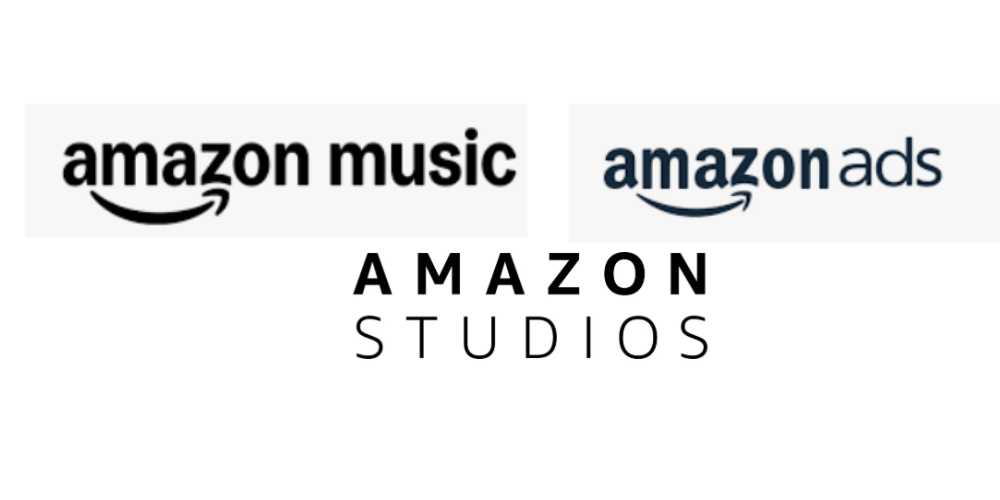
Amazon Music, Ads, and Studios slightly adapt the color palette and font but keep the primary logo elements.
What Businesses Can Learn from the Amazon Logo
Check out the following for the most essential lessons businesses can learn from Amazon’s iconic logo in establishing their brand.
Simplicity is the KEY. Keep things simple and uncluttered. Your brand will thank you later. A simple logo is easily recognizable.
Symbolism matters, too. Convey your products, services, and values with symbols.
Consider scalability for impact across channels and all sizes (applications). Design a scalable logo that you can use for your product packaging, website, social media, and so on.
Colors must reflect your brand’s personality. For instance, if you’re an eco-friendly brand selling organic products, opt for a green logo to show your commitment to conserving the environment.
Choose typography carefully! Amazon’s logo uses bold and easy-to-read typography. Use a legible, readable font that matches your brand.
Consistency is the name of the game. Amazon teaches brands to embrace consistency for visual cohesion and harmony. Ensure your logo appears consistently across touchpoints like social media profiles, email newsletters, and websites.
Design An Amazon-Inspired Logo with Logogenie AI Logo Maker
Do you love the Amazon logo, but are stuck for ideas? Use our intuitive, straightforward AI logo maker and design an impactful logo in three simple steps. We also have in store thousands of templates and user-friendly customization tools.
A quick look inside our logo maker: Just enter your details, and let us do the rest! Our AI logo generator can generate hundreds of logo template ideas from which you can choose for customization. Once satisfied, you can download and use the logo for branding efforts.
Final Words….
The evolution of the Amazon logo teaches us that a design doesn’t have to be perfect out of the gate to be iconic. Instead, everything begins with understanding your brand’s purpose, adapting to change, and remaining committed to customer experiences.
Amazon Logo: FAQ
What’s the font used on the logo?
Officina Sans Bold—it’s custom-designed for Amazon and is based on two dynamic, classy fonts - the Capital Gothic Bold and the Grotesk Bold. It displays a neat, precise look and features smooth, arched lines and slightly curved line tails.
For instance, the letter “Z” has a bottom horizontal bar arched to the center, as if hugging the arrowhead. The typeface also balances the graphics and inscriptions to create a harmonious appearance.
Is it trademarked?
Yes, the logo, its icons, and marks are trademarks. To use them, you must ask permission from the company.
Is there a hidden image in the logo?
Yes. Not one but two. The first is the friendly smile hidden in the arrow, conveying the company’s approachability, and the second is the arrow linking the two letters “A” to “Z,” symbolizing that the online marketplace sells everything from A to Z.
What type of logo is of Amazon’s?
Combination marks. The logo combines wordmark and graphics, which, for us, is an excellent decision from Amazon, because a combination of logo is more effective than the other types, like wordmarks, monograms, icons/symbols, abstract marks, or emblems. It works for most brands because of its clarity and versatility, allowing for creativity and storytelling through imagery and text. Start your own monogram logo here

