

Business Cards
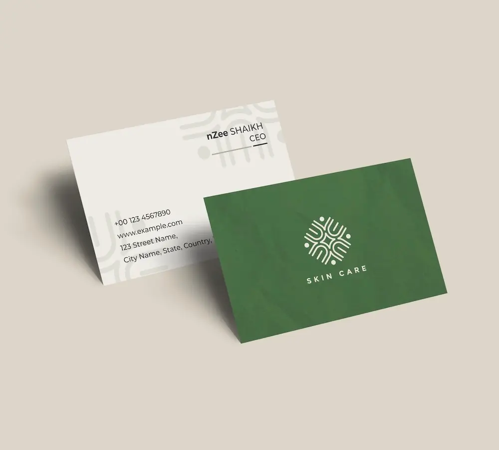
Create professional business cards with your letter i logo and impress clients from the very first meeting.
See product templates
Discover our selection of logo templates designed for your industry.
Explore our range of creative logo styles tailored to every type of company.
Browse unique letter logo templates designed to suit any type of business.
Use our easy-to-use online tools to create dazzling branded products with your logo and matching colors! Discover our wide range.
Explore a full range of creative branded products that you can customise online.
Design a professional letter I logo with our online logo maker. Personalize premium monogram templates and create a memorable brand in just a few minutes.
From Intel to IKEA, leading brands prove that even the simplest letter can become iconic. A professional monogram logo gives your business a clean, distinctive identity.
Choose from our letter i logo templates and customize your design with our logo maker
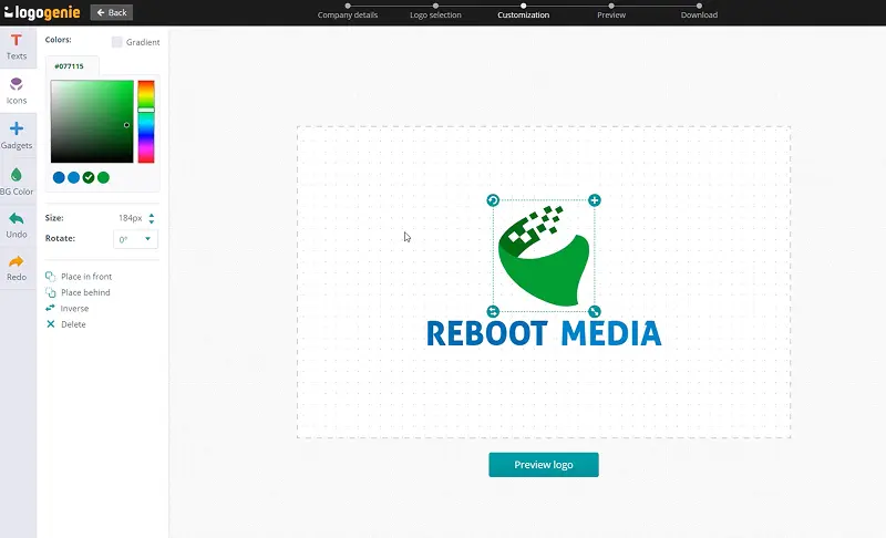
Enter your information, customize your logo, and download it in just a few clicks
Start designing your logo by entering your company name, slogan, and industry.
Browse through thousands of letter i logo designs and customise your logo online.
Download high-resolution files suitable for print and digital media.
Discover simple tips to create a letter i logo that fits your brand

Although the letter I looks oddly simple, designing it into a meaningful letter I logo can be challenging. Its narrow form means the logo’s typography, weight, color, and ornamentation must work harder to turn its simplicity into a brand-defining statement. Just look at IBM’s iconic horizontal stripes that add visual richness while maintaining strict geometry.
Exceptional logos that start with I feel intentional from every angle. A classic example is Intel’s flowing lowercase that suggests the tech giant’s approachable innovation. The idea is to decide early if you want your logo to stand alone as a monogram or anchor a full wordmark, with each path demanding different design thinking.
How to choose the layout, colors, and fonts for the perfect logo
Want an effective I logo design? Symmetry and vertical balance are your keys! For instance, IBM’s horizontal rule pattern breaks the monolith of the letters into rhythmic, layered bands. Intel favored a swooping lowercase within a circle to give its logo a sense of motion and energy. IKEA’s structure is noteworthy, too. Its horizontal wordmark creates a wide, anchored presence that dominates anywhere and everywhere.
An effective I logo brand design performs splendidly on any brand touchpoint, like app icons and giant signage. Vertical logos can be especially tricky on small screens. So, test your design across different formats.
Did you know the color stories behind the best logos starting with I are as varied as the brands themselves? Take IBM’s classic blue for example. It’s synonymous with computing authority and corporate trust. Look at IKEA’s yellow-and-blue scheme. It focuses more on the brand’s national identity (Swedish) and exceptional retail psychology. And then there’s ING’s vibrant orange, which differentiates it from other financial brands.
When you design letter I logos, testing colors at different sizes is essential to ensure legibility on any surface. You want the letter I to register as a branded symbol, not a typographic artifact.

Designing the typography of logos with I can be challenging because of the letterform’s vertical simplicity. Your font must match your brand’s messaging. Examples? IBM uses slab-serif to convey structured power, while Intel prefers a rounded sans-serif that feels technological and approachable. As for IKEA, there’s something warm and functional in its humanist sans. ING’s geometric typeface? That’s tradition and forward-looking in equal measure.
The font in your logo must be instantly distinguishable. You can experiment with its weight, terminal style, or even apply custom modification. Your job is to handcraft an I that will become iconic, not forgettable.
Yes, all logos can be fully customized. You can adjust colors, fonts, layouts, and icons to create a unique letter i logo that matches your brand identity.
You’ll receive high-resolution files including PNG, JPG, PDF, and vector formats like SVG or EPS, making your letter i logo usable across all digital and print media.
Yes, once purchased, your logo is yours to use for all commercial purposes including websites, business cards, social media, and marketing materials.
Yes, you can return anytime to edit your letter i logo. Update colors, fonts, or layouts as your business evolves.
No design skills are needed. Logogenie’s intuitive tools make it easy for anyone to create a professional letter i logo in just a few clicks.
Yes, your logo can be used across all platforms, including websites, social media, business cards, signage, and merchandise, ensuring consistent branding everywhere.
Yes, your logo is designed to work across all digital and print formats, including websites, email signatures, business cards, and advertising materials.
Yes, your logo is created in high resolution and scalable formats, ensuring it remains sharp and professional as your brand expands across different platforms and sizes.
Everything you need to launch your letter i business and promote your brand.
Create professional business cards with your letter i logo and impress clients from the very first meeting.
See product templates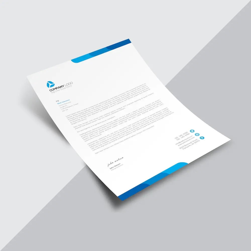
Create custom letterheads with your letter i logo and reinforce your brand with every document you send.
See product templates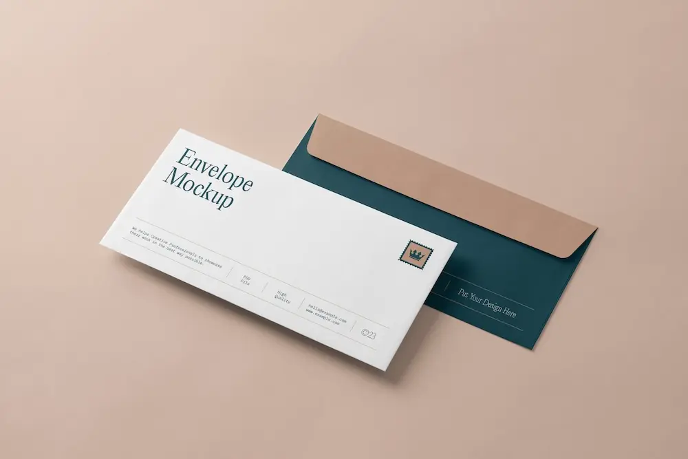
Create custom envelopes with your letter i logo to match your letterheads and give every mailing a professional finish.
See product templates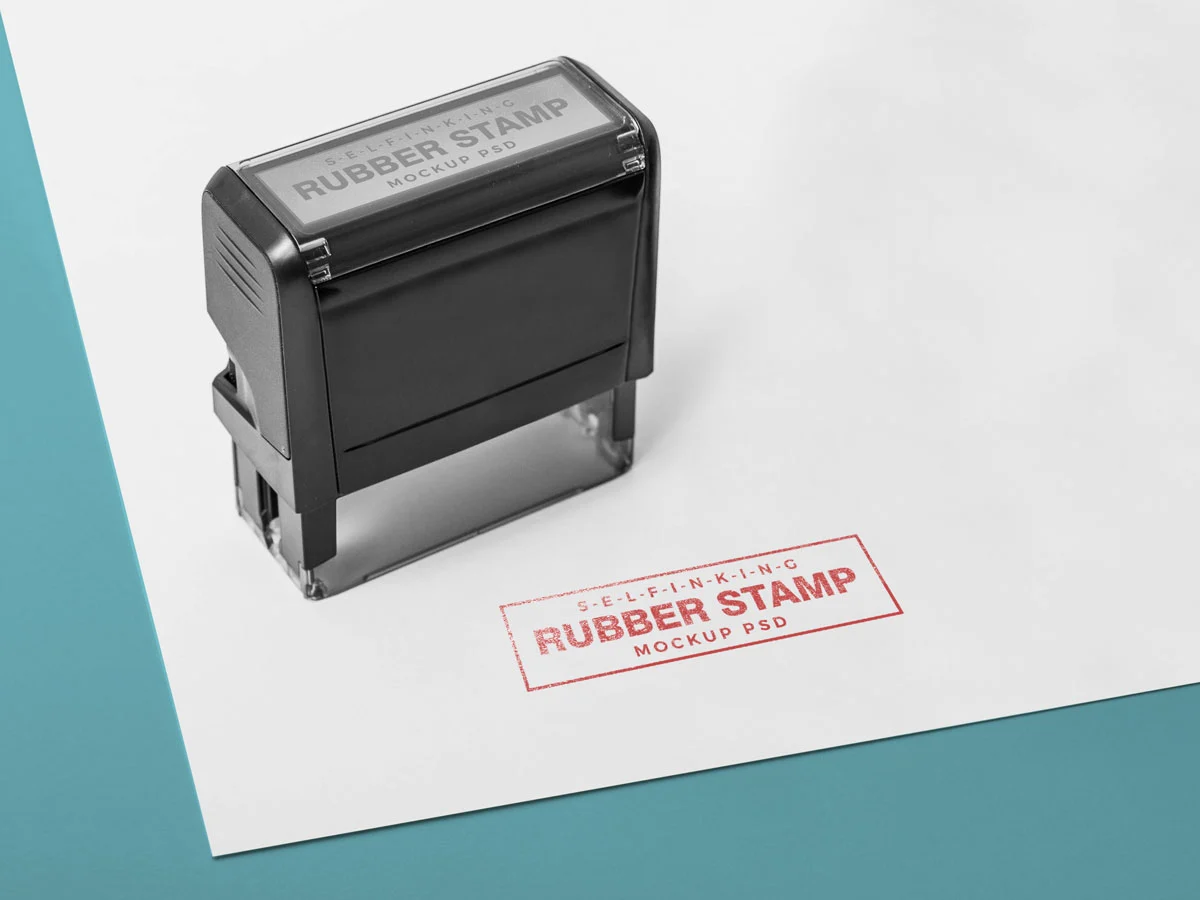
Create custom stamps with your letter i logo or business details for all your professional documents.
See product templates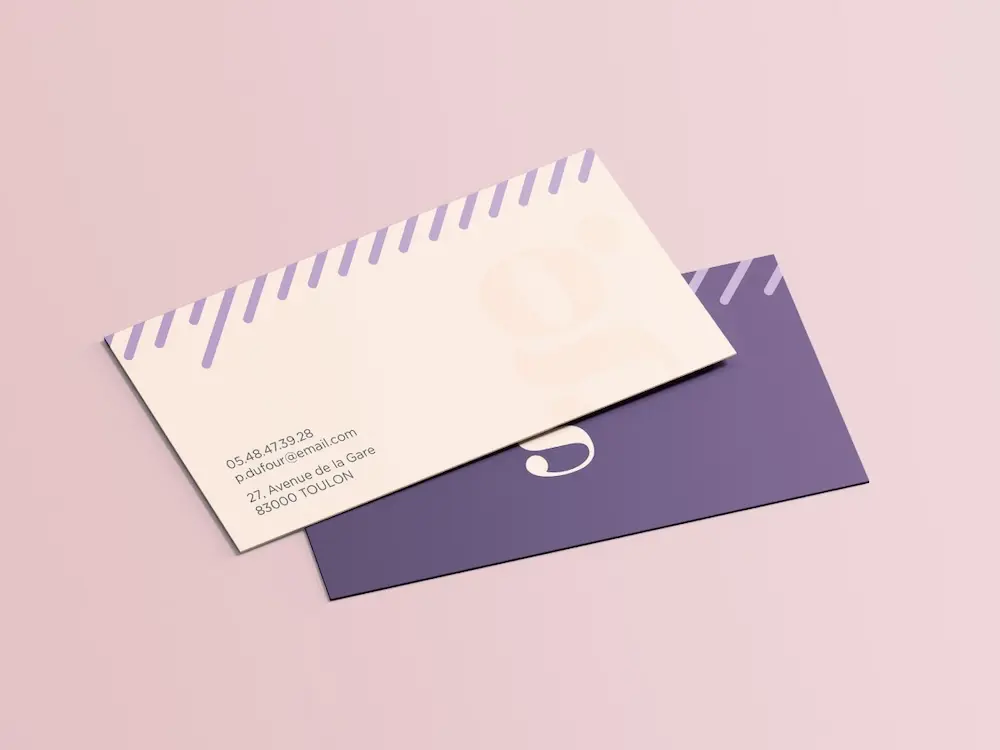
Create personalized correspondence cards with your letter i logo to add a professional touch to every business mailing.
See product templates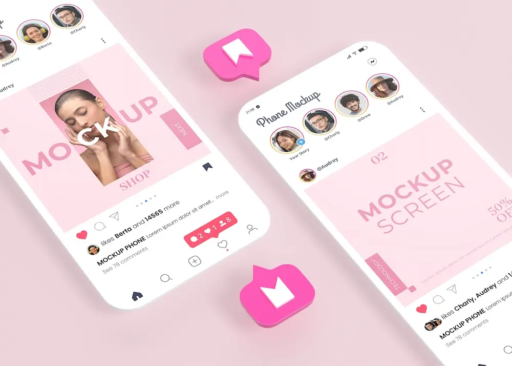
Create digital branding materials with your letter i logo for social media, emails, invoices, and more.
See product templates