

There’s something quietly genius about the Peloton logo. It’s a single letter (a bold, circular “P”), and yet it manages to say everything, including speed, community, fitness, and forward momentum.
Since Peloton launched in 2012, that iconic mark has appeared on bikes, treadmills, apps, merchandise, and studio walls across the globe. But how did a startup founded by five friends in New York create one of the most recognized symbols in modern fitness culture? Let’s spin through the full story.
What Does the Peloton Logo Look Like?
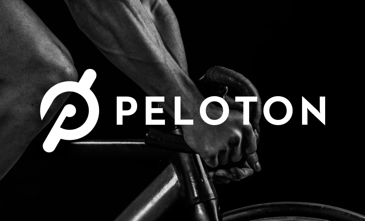
This logo looks surprisingly (yet refreshingly) simple. We see a bold, capital “P” set inside a circle. Something simpler is virtually non-existent. But, spend a few more seconds with it, and the layers start to reveal themselves.
The P letter icon
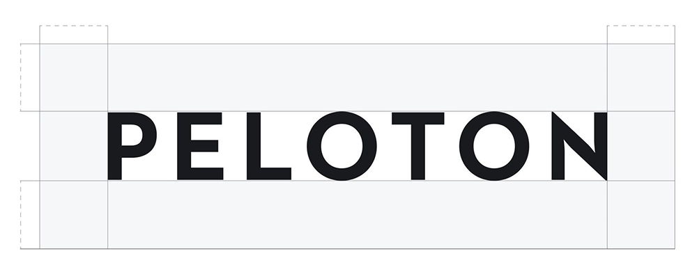
The lettermark (“P”) sits right in the center and rendered in a thick, custom sans-serif typeface. It’s the kind of letterform that looks great at two inches or twenty feet.
New York-based graphic designer Eric Hwang created the Peloton logo. He drew on elements from Futura and Brandon Grotesque to develop something entirely proprietary.
You won’t find this font available for download anywhere. It belongs exclusively to the brand. You can also create your very own perfect letter logo with Logogenie!
The circular design
The “P” sits inside a perfect circle. You might think this isn’t purposeful. Circles in design symbolize wholeness, unity, community, and perpetual motion (think wheels, cycles, tracks, and more).
For a fitness brand built on spinning bikes and community workouts, a circular frame is almost poetically perfect. The shape does half the storytelling before anyone reads a single word.
Minimalist branding
The logo uses a monochromatic palette, mostly black on white or white on black. There are no gradients and no drop shadows. You won’t see any unnecessary decoration, either. It shows just how restrained (and committed) Hwang was in designing this logo, ensuring to create a logo that’s endlessly versatile.
This logo works well on anything. Put it on a touchscreen app, emboss it on a bike frame, print it on a T-shirt, or even project it on a studio wall. It has clean visual authority. And that’s the real secret to creating a good letter logo.
Peloton Logo Meaning Explained
It’s worth pointing out that the Peloton logo meaning is more than a pretty design. Its essence runs deep. Hwang chose every element with real intention.
What does the P symbol represent?
Let’s start with the most obvious. The letter P icon stands for Peloton. However, it has two distinct purposes). The stem and curve of the letterform subtly echo the shape of a bike pedal in motion.
Designer Eric Hwang literally merged the company initial with the core piece of equipment the brand was built around. It’s a clever bit of visual storytelling that rewards a second look. And it’s the kind of hidden meaning that separates a great logo from a forgettable one.
Cycling origins
The word “Peloton” itself comes directly from French cycling culture. In a road race (like the famed Tour de France and the equally popular Giro d’Italia), the peloton is the main pack of riders who travel together, each benefiting from the group’s collective aerodynamic energy.
Peloton co-founder (and avid cyclist) John Foley chose the name deliberately. He strongly believed that the brand’s DNA has the same sense of shared effort and drafting off each other’s momentum as its bicycle racing namesake. And the circular enclosure around the “P” quietly echoes this belief.

Community symbolism
The circle also reinforces the brand’s core mission, which is to build community. Peloton wasn’t just selling bikes. This brand was selling belonging (or a sense of it). The circle quietly declares that each customer is a part of something definitely (and profoundly) bigger.
It doesn’t matter if you’re clipping in alone at 6am or competing on a live leaderboard with thousands of riders worldwide. This circular form holds the whole community (of cyclists and fans) together.
Peloton Logo Evolution Over Time
Did you ever want to know the most surprising part of the Peloton logo history? Well, there isn’t much of one, which is kind of the whole point.
Early branding
Peloton first appeared in January 2012, complete with the thoughtfully designed logo. From day one, the brand went live with the circular “P” mark paired with a clean wordmark “PELOTON” set in the same custom all-caps typeface.
The logo was remarkably (and surprisingly) polished for a startup company that was still raising Kickstarter funds and trying to convince investors that people would pay $2,000+ for a home spin bike. It portrayed a confident visual identity. It didn’t look like a company “still” finding its feet (or even testing the waters). Instead, it looked like a brand that already knew exactly who it was.

Modern simplified icon
Over the years, Peloton has leaned increasingly into the standalone P letter icon. The brand used it without the wordmark (“PELOTON”) across many touch points. Such a design tweak mirrored a broader trend in logo design. The symbol alone becomes sufficient as brands gain recognition.
Don’t believe us? Think of the Nike swoosh. One look (even without the wordmark “NIKE” and you know it’s Nike). It’s the same with Apple’s “bitten apple” logo. Peloton’s “P” was confidently heading in that same direction.
These standalone marks define iconic brands, making them some of the most inspiring logo designs (and from which you can draw inspiration for creating yours).

App icon variations
You can see the most visual day-to-day variation of this logo on the Peloton app logo. On iOS and Android, the icon shows the bold “P” mark on a high-contrast dark background. That’s not surprising since the company wants to make its logo optimized for small-screen legibility.
And then there are seasonal marketing campaigns that occasionally bring in color shifts in surrounding brand assets. However, the core “P” mark itself remains completely unchanged. The brand is genuinely confident about the logo design that they’re strongly disciplined NEVER to tinker with it.
Why the Peloton “P” Icon Works So Well
Not all lettermarks are the same (or at least elicit the same reaction). Here’s why Peloton’s “P” punches so far above its weight.
Lettermark psychology
Lettermark logos work best when the designer or artist meaningfully (or intentionally) customized the letter and not just typed in a font. They drew it with purpose or meaningful intent. Peloton’s “P” achieves this.
The bespoke typeface shows confident stroke weights and precise geometry. It has enough visual tension to feel energetic without being aggressive. It’s a letter that “moves,” even when it’s standing still. That’s the very essence of custom logo design!
Simplicity in tech-fitness branding
Peloton is one of the classic examples of how fitness and technology seamlessly blend. We have two industries that prize clean, minimal aesthetics. Examples? Apple, Nike, Lululemon. The best brands in this space trust simplicity above all else.
Peloton understood from the start that a cluttered logo would fight against the product experience. Their equipment is sleek. Their app is clean, and their instructors are stylish. The logo was always going to have to match that energy. It’s worth reiterating that complexity, in branding, is the enemy of memorability.
Red color psychology
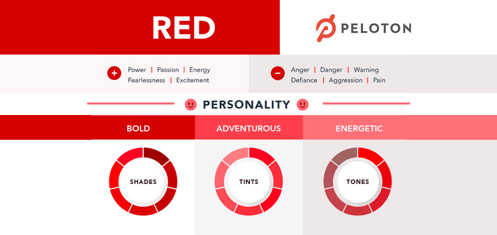
While the primary logo is monochrome, red appears prominently throughout Peloton’s brand. We see it in Peloton’s marketing, UI elements, and even secondary logo treatments. Red is one of the most psychologically charged colors in design, signaling energy, urgency, passion, and intensity.
Red is an inspired choice for a fitness brand trying to motivate people to clip in at 5:30am. It rallies you (and cycling fans and fitness buffs). And if you’re thinking about color choices for your own brand, you will want to check out our post on designing the right logo for your brand, where we presented how color and other design elements work together to create a meaningful logo.
Peloton Logo PNG, Transparent & SVG Versions
Ever wondered whether a Peloton logo PNG is great for editorial, press, or design reference projects? Satisfying your curiosity starts with an understanding of what each file format actually means in practice (including how professional designers use them).
Usage examples
We always use a Peloton logo transparent file (a PNG with a transparent background) when the logo needs to sit cleanly over different colored backgrounds without a white or colored box appearing around it. This file format is quite ubiquitous in blog posts and presentations. You can also slap them on press kits.
On the other hand, we place the Peloton white logo version (the mark rendered entirely in white) on dark or photographic backgrounds (where a black mark would disappear completely).
Vector format explanation
A Peloton logo SVG is a vector file. That means the logo is constructed from mathematical paths instead of pixels.
Their main advantage is that you can scale them to just about any size (from a tiny favicon to a large, full-wall mural or even the size of the digital billboard screen on NYC’s Broadway) without losing a single pixel of quality.
That’s why we always use vector graphics for branding or any activity that requires slapping on a professional logo.
Peloton Logo vs Other Fitness Brand Logos
Here’s a quick comparison of how the category’s biggest players approach visual identity.

Nike
Nike’s “swoosh” mark is arguably the most successful logo ever created. Like Peloton’s P, it’s a custom abstract mark that communicates movement without spelling anything out. Both logos prove that simplicity is the ultimate power move in branding.

Lululemon
The stylized omega “A” mark is another minimalist letterform that prioritizes elegance over explanation. Lululemon and Peloton target premium fitness consumers. Both also reflect that aspiration through clean, geometric precision.

Equinox
Equinox’s identity leans into sophisticated typography and a luxury gym aesthetic. While Peloton’s P is energetic, Equinox feels more formal and restrained. That’s unsurprising since Equinox positions its gyms as the spa end of the fitness market.

Apple Fitness+
Peloton’s closest tech-fitness rival borrows the Apple logo with a “+” appended. It inherits enormous brand equity from the parent company (Apple) but lacks the standalone fitness identity that Peloton has built entirely from scratch with its own mark.
It’s worth pointing out that Peloton’s logo holds its own in elite company. More importantly, it’s the only one in the category built from nothing into something globally iconic within a single decade.
Want to design your own brand’s identity? You can start by writing a logo brief.
Design Lessons from the Peloton Logo
You can learn many things from Peloton’s visual identity, whether you’re building the next big fitness startup or launching a local yoga studio.
- Start with meaning, not aesthetics. Eric Hwang built a symbol that connected the letter P to a bike pedal and to the idea of community. So, ask what your logo actually needs to communicate before picking a color or font.
- Custom typography is worth the investment. A custom typeface ensures your identity can never be accidentally replicated by a competitor. Even subtle customizations to an existing font can make a mark feel proprietary.
- Design for every format from day one. The Peloton logo works on a 55-inch touchscreen and a 1-inch app icon with equal grace. Always test your logo at thumbnail size. It isn’t ready if the design falls apart small.
- Don’t change a logo that’s working. Peloton has never touched their core mark in over a decade. They’ve resisted the urge to “refresh” something that consumers already love.
- Let restraint do the heavy lifting. Every element earns its place (like Peloton’s authoritative and clean monochrome logo and energetic red accent). Nothing is added for decoration alone. If you’re drawn to this kind of pared-back approach, Logogenie’s logo maker are built exactly for it.
Final Thoughts
The Peloton logo proves that great branding doesn’t need to be complicated. It only needs to be “intentional.” One letter. A perfect circle. A bold custom typeface. A color palette that means business. That’s the whole recipe. And yet, it’s become one of the most recognized icons in fitness history.
Create Your Logo with Logogenie Today!
And if you’re ready to build something just as purposeful for your own brand, there’s no better time to start. Head over to Logogenie and see what’s possible. Your community is waiting. Give them something worth rallying around.
FAQs
What does the Peloton logo mean?
It symbolizes motion, speed, and a sense of community (and a bike pedal reflecting the cycling origins of the brand).
Who designed the Peloton logo?
Eric Hwang created it in 2012.
Why is the Peloton logo effective?
The simplicity makes it versatile across applications (equipment, apps, and athletic apparel), with the monochromatic palette + red accents conveying focus, authority, and motion.