What’s the most important thing you’re thinking of when designing a logo?
You want it to be modern.
You want it to be recognizable and memorable.
You want it sleek.
You want it to evoke the spirit of the brand.
Why do logos change? – Because the audience changes. Back in the 1960s, people liked a different type of design from the one we like today. We have proof for that! Let’s discuss how some of the most popular logos have changed over time. This evolution will teach you how to think about change while you’re designing the logo of any brand.
1. Pepsi
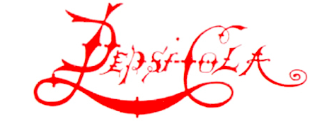
Pepsi’s logo timeline is quite interesting for an analysis. It’s a pretty long evolution, starting from 1898. From today’s point of view, the first logo has an unreadable font and is overly complicated. However, we notice that element that’s a carrier of all changes that follow - the wave, swirl… call it whatever you like.
Throughout the following four decades, Pepsi changed the font, but the color and foundational design remained the same. In 1950, we notice a big change – the company introduced color in its logo, probably to differentiate itself from the competitive Coca Cola.
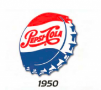
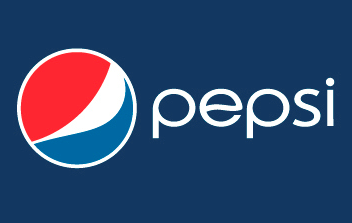
In this logo, also see the design on a cap. The colors and the cap, in addition to the swirl, remain as the carriers of change in all future designs. Later on, Pepsi finally changed the font to something more readable, and we end up with the current logo that looks like this:
2. Mercedes-Benz
When you think of Mercedes-Benz, what’s the first image that comes to your mind? It’s the three-pointed star, isn’t it? It’s a symbol of the land, sea, and air – representing the brand’s aspirations to dominate all of them with its engines. However, that symbol was developed in 1909. The first Mercedes car was marketed in 1901. Do you know what the first logo looked like?
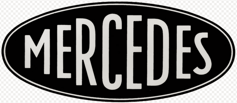
We don’t see a carrier of design change here. In 1909, when the star was born, the logo had no similarities with the first one. That star, however, remained as a stamp of recognition for the brand. Although it evolved, it’s still present in today’s logo. Here’s the current logo of Mercedes-Benz:

3. Goodyear
Goodyear has one of the most iconic logos we know of. Do you know why? – Because it remained relatively universal over the years. The color and font went through slight changes, but we can still recognize the initial design in today’s logo.
The main element of the logo is the Wingfoot – the symbol that the founder chose because he was inspired by the statue of Mercury, an ancient god from Roman mythology. This is what the logo looked like when it was launched in 1900:

And this is what it looks like today:

4. Nike
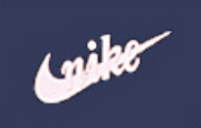
Movement. Simplicity. Classic, but modern design. That’s what Nike represents as a brand, and the logo stands for those values, too. The first logo was designed by Carolyn Davidson in 1971. She was getting an hourly rate of $2 for that job. Who would’ve thought that her design would become the most recognizable logo of the 20th century?
The check mark shape (known as the Nike Swoosh) was initially accompanied with the brand’s name written across it. This is what the original logo looked like:
Over the years, the design changed, mainly in the font and position of the lettering. In 1995, Nike finally decided to lose the lettering from the logo, since the swoosh was already a recognizable sign for the brand. Today, this is what the logo looks like:
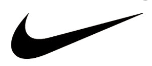
We still see the older logo with lettering from time to time. We also see changes in color in the single swoosh. But we still know it’s Nike, and that’s all because the designer came up with an element that’s a carrier for change.
Genius logos seem easy to design, don’t they? They are all simple. It’s the idea and the process of design behind them that matters. As logo designers, we must always keep change to mind, and infuse elements that would allow the initial vibe of the brand to stay persistent throughout that evolution.